Skip to content
Can a Factory Match a Specific Pantone Color : Apparel Color Matching Explained
Your trusted Women’s Apparel Development & Manufacturing Partner from China
- Jerry
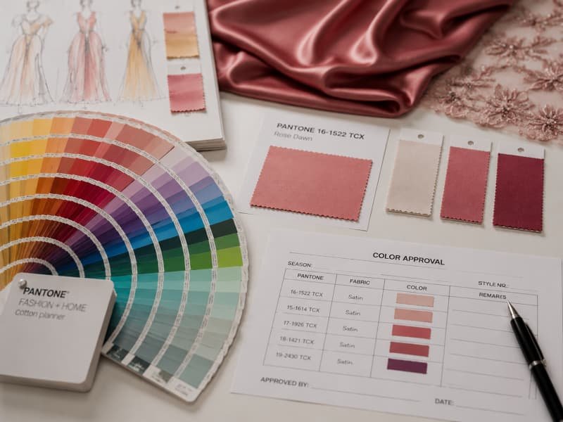
A Pantone reference can look reassuringly precise inside a tech pack. It has a number, a standardized name and, at least on paper, one clearly defined color target. Yet the moment that color moves from a screen or color card onto satin, mesh, velvet, jersey or sequins, the result becomes more complicated. The color is no longer only a number. It is the combined result of fiber chemistry, dye formulation, fabric construction, surface reflection, finishing, lighting and production control.
Yes. A qualified apparel factory can usually match a specified Pantone color closely, but a Pantone number alone does not guarantee an identical result on every material. A reliable match requires the correct Pantone system, a physical reference, lab-dip or strike-off approval, agreed color tolerances, controlled-light evaluation and bulk shade monitoring. The approved material – not the computer screen – should become the final production standard.
That distinction matters because a dress can be technically close and still look wrong in a campaign photograph, beside a matching handbag or under store lighting. Imagine approving a rich burgundy satin sample in the office, only to discover that the bulk dresses look brown under evening retail lights. The factory may have followed the Pantone number, but the color-management process was incomplete. The sections below explain how experienced fashion teams prevent that kind of surprise.
Can a Factory Match a Pantone Color?
Yes. An experienced apparel factory can usually match a specified Pantone color closely, but the result must be developed on the actual production material. A Pantone number is the target, not the finished standard. Reliable matching depends on the fabric, dyeing method, physical reference, lab-dip approval, lighting conditions, agreed tolerance and bulk shade control.
Is an Exact Match Possible?
A factory can often produce a color that appears extremely close to the requested Pantone reference, but “exact” needs to be defined carefully. A Pantone textile swatch, polyester satin, cotton poplin, stretch jersey and velvet do not reflect light in the same way. Even when they are developed toward the same color target, they may not appear identical when placed side by side.
In apparel production, the more useful goal is an approved and repeatable commercial match. The factory develops the requested color on the selected fabric, the brand evaluates it, and the approved lab dip becomes the production reference. Bulk fabric is then checked against that physical approval.
A professional color evaluation looks at more than whether the sample seems generally red, blue or green. It considers:
- Hue direction, such as too yellow, red, blue or green
- Lightness, meaning whether the shade is too dark or too pale
- Saturation, meaning whether it is too bright or too dull
- Surface appearance, including gloss, texture and transparency
- Color behavior under daylight, retail light and warm indoor light
A responsible factory should not promise perfect color identity across every substrate. It should explain what can be controlled, identify the main risks and agree on what will count as an acceptable result before bulk dyeing starts.
What Is an Acceptable Match?
An acceptable match is a shade that meets the brand’s approved visual standard and any agreed instrumental tolerance under defined lighting conditions. It is not simply a color that appears “close enough” during a quick office review.
The controlling reference should be clear. It may be:
- A current physical Pantone TCX swatch
- An approved lab dip on the actual bulk fabric
- An original garment from a previous collection
- A fabric swatch supplied by the brand
- Instrumental color data used alongside visual approval
In many established buying teams, visual and instrumental evaluation are used together. A spectrophotometer can measure the difference between the submission and the standard, but the final decision still needs human judgment. Reflective satin, transparent mesh, sequins and pile fabrics can look commercially wrong even when a numerical result appears reasonable.
There is no single color-difference limit that suits every brand and every fabric. Some brands use a tight internal tolerance for smooth solid fabrics while allowing more flexibility for textured, mélange, washed or reflective materials. The acceptance level should therefore be agreed by product, fabric and color importance rather than copied from a generic rule.
Why Physical Standards Matter
A screen image should never be the final color standard for apparel production. The same digital file can appear warmer, cooler, lighter or darker on different monitors. Screen brightness, display calibration, browser settings and surrounding light all affect what the viewer sees.
A physical reference allows the brand, factory, fabric mill and testing team to review the same target. For textile development, a current physical Pantone textile swatch is far more reliable than a screenshot of a color code.
The hierarchy of color references should normally be:
- Approved bulk-quality fabric or retained production garment
- Approved lab dip on the intended fabric
- Current physical Pantone textile swatch
- Approved original swatch supplied by the brand
- Digital reference used only for communication
Physical references also need proper handling. Pantone books and fabric swatches can fade, become dirty or change after repeated exposure to sunlight and handling. Important standards should be stored away from direct light, labeled with the approval date and replaced when they become visibly aged.
When Matching Becomes Difficult
Some colors and materials are more difficult to match consistently than others. Very bright shades, deep blacks, dark navy, fluorescent colors, dusty neutrals and blue-based reds can require more development work. The difficulty increases when the garment combines multiple materials that must appear visually coordinated.
Common high-risk combinations include:
- Satin shell with matte lining
- Mesh panels over skin-tone backing
- Velvet body with smooth woven trims
- Dyed fabric with matching plastic hardware
- Main fabric with tonal embroidery thread
- Stretch fabric combined with non-stretch binding
- Dark fabric beside white or pale contrast panels
The right question is not only, “Can the factory match this Pantone?” It is also, “Can the factory control this color on the actual garment construction, across every visible component, and repeat it in bulk?”

Which Pantone Code Should You Provide?
For dyed apparel fabrics, brands should normally provide a Pantone Fashion, Home + Interiors textile reference, preferably TCX, together with a physical swatch when color is critical. TPG can support product-surface development, while Pantone C and U are intended mainly for graphic printing. The correct code depends on what is being colored.
What Is Pantone TCX?
TCX is commonly used for apparel, textiles and soft goods. The reference is presented on cotton, making it a more suitable starting point for fabric development than a graphics color printed on paper.
A complete color instruction should include the full Pantone number and suffix. Writing only “Pantone burgundy” or “Pantone red” is not sufficient because there are many visually similar shades with different undertones and depth.
A useful color entry in a tech pack may include:
- Pantone code and suffix
- Pantone color name
- Fabric or component name
- Physical swatch reference
- Required finish
- Match, coordinate or contrast instruction
- Approval method
- Relevant light sources
TCX is still only a target. A cotton swatch and a polyester satin dress may never look identical because satin reflects strong highlights. The dye house may need to adjust the formula so the finished garment creates the intended visual impression rather than mechanically copying the cotton standard.
Is TPG Suitable for Fabric?
TPG references are printed on paper and are commonly used for product surfaces, accessories, coatings and hard goods. They can be helpful when a brand is coordinating apparel with shoes, handbags, packaging or other product categories.
A TPG color can be used as an initial direction for fabric, but the final textile color should still be approved on the actual fabric. Paper and textile surfaces do not absorb or reflect color in the same way.
When a TPG code appears in an apparel tech pack, the factory should confirm:
- Whether it applies to the main fabric, trim or packaging
- Whether a corresponding textile reference is available
- Whether the brand expects a literal visual match
- Whether the final approved lab dip will replace the paper reference
- Whether other products must coordinate with the garment
The same principle applies when a brand supplies a paint chip, leather swatch, packaging card or digital image. It can guide development, but the production fabric must become the final approved standard.
Are Pantone C and U Used for Garments?
Pantone C and U belong to the graphics system. C indicates a graphics color shown on coated paper, while U shows the appearance on uncoated paper. These references are useful for printed branding and packaging but are not designed as primary textile dyeing standards.
They are commonly used for hangtags, printed care cards, packaging boxes, tissue paper, logo printing, labels, printed inserts and marketing materials. A graphics code may also appear in screen-print, heat-transfer or artwork files. In that case, it may be relevant to the print rather than the fabric ground color.
Reference | Most Suitable Use | Main Limitation in Apparel |
TCX | Dyed textiles and soft goods | Appearance still varies by fiber and surface |
TPG | Product surfaces, accessories and coated materials | Paper is not the final textile substrate |
Pantone C | Printing on coated paper | Not a fabric dye standard |
Pantone U | Printing on uncoated paper | Not a fabric dye standard |
Physical fabric swatch | Repeating an established garment color | Must be stable, clean and clearly approved |
If a tech pack uses Pantone C or U for the main fabric, the factory should not guess silently. The code should be clarified and translated into a textile development process.
Should You Send a Physical Swatch?
A physical swatch is strongly recommended when the color is central to the brand identity, difficult to describe or based on an existing bestseller. It is also helpful when the brand wants several factories or product categories to coordinate around one established shade.
The swatch should be large enough for visual review and, where required, instrumental measurement. The brand should clearly mark the approved side and area. An old garment may contain fading, washing variation or different shades at seams and folds, so the exact target area needs to be identified.
The submission should state:
- Whether the swatch is before or after washing
- Whether the fabric finish must also be reproduced
- Whether the color should match or merely coordinate
- Whether the swatch may be cut for testing
- Whether the original composition is known
- Which garment parts must use the same color family
Using both a Pantone reference and a physical swatch is often the strongest approach. The Pantone code provides a standardized communication point, while the swatch shows how the brand expects the color to behave on a real material.

How Does Pantone Matching Work?
Pantone matching usually follows a controlled sequence: confirm the color reference, select the production fabric, develop lab dips or strike-offs, approve the color under defined lighting and verify the bulk lot against the approved standard. Bulk dyeing should not begin simply because a Pantone code appears in the tech pack.
What Information Is Needed?
Color development becomes more efficient when the factory receives a complete brief at the beginning. A code without material and finish information can lead to repeated submissions because color is affected by the fabric itself.
The color brief should include:
- Complete Pantone reference
- Physical card or approved swatch
- Fiber composition
- Fabric construction
- Fabric weight
- Stretch level
- Surface finish
- Washing or finishing process
- Lining and trim requirements
- End market
- Testing requirements
- Target approval date
The intended visual effect also matters. A brand may want a satin dress to feel rich and deep rather than bright and glossy. In another project, the brand may prioritize photography performance and want the color to stay vivid under studio lighting.
These choices affect how the dye technician interprets the target. A color can be technically close to the reference but visually wrong for the collection. The factory should therefore understand the product context, not only the number.
How Is a Lab Dip Developed?
A lab dip is a small fabric sample dyed before bulk production. It shows how the requested shade performs on the selected material and allows the brand to make a controlled approval decision.
A standard workflow may involve:
- The brand supplies the color reference.
- The factory confirms the production-quality fabric.
- The dye house creates a trial formula.
- Two or three shade options may be submitted.
- The brand reviews the samples under controlled light.
- One option is approved or revised.
- The approved formula is prepared for bulk dyeing.
- Bulk fabric is checked against the approved lab dip.
Lab-dip development often takes several working days, although timing varies with the fiber, dye class, shade difficulty and dye-house schedule. A complex dark shade or a color on a blended fiber may require more than one development round.
Comments should be precise. “Too red by a small amount,” “slightly darker,” or “reduce saturation without making it grey” gives the dye house a clearer direction than “the color is wrong.”
What Is a Strike-Off?
A strike-off is used mainly for printed fabrics. It allows the brand to approve print color, artwork size, repeat, registration and print quality before bulk printing.
Unlike a lab dip, which focuses on a solid-dyed fabric color, a strike-off may involve several colors interacting with the fabric ground. The same artwork can look different on white polyester, ivory viscose, rib knit or crepe because absorbency and surface texture change the print result.
A strike-off review should cover individual print colors, ground color, artwork scale, repeat distance, color registration, edge sharpness, ink penetration, surface hand feel, curing or heat-setting result, and wash and rubbing performance.
Development Item | Used For | Main Approval Points | Common Timing Range |
Lab dip | Solid dyed fabric | Hue, depth, saturation and light behavior | Several working days per round |
Strike-off | Printed fabric | Color, scale, registration and print quality | Several days to roughly two weeks |
Thread card | Sewing or embroidery thread | Tonal match, contrast and sheen | Often selected from stock shades |
Trim sample | Zipper, elastic, button or binding | Color harmony and material appearance | Depends on stock or custom development |
These timing ranges are planning guides rather than fixed guarantees. Custom materials, repeated revisions and specialized processes can extend development.
How Should Color Be Approved?
Color approval should be traceable. Every submission should have a unique number or label, and the final decision should identify exactly which sample becomes the controlling standard.
Clear approval statuses include:
- Approved for sampling
- Approved for bulk
- Approved with comments
- Re-submit
- Rejected
- Reference only
- Nearest available shade accepted
A sample color used for fitting should not automatically be treated as approved for production. Factories sometimes use available fabric for the first prototype to test structure and fit. The production color may still require separate lab-dip approval.
The approval record should include the fabric code, Pantone reference, option number, date, reviewer, light source and any accepted limitation. This becomes essential when several people are reviewing the same collection or when the order contains many colors.
Good approval discipline saves time later. Most color disputes happen because the controlling standard was unclear, not because nobody looked at the color.

What Affects Color Accuracy?
Color accuracy is affected by fiber chemistry, fabric construction, surface texture, finishing and light. The same dye target can appear different on cotton, polyester, nylon, satin, mesh and velvet. A reliable match must therefore be developed separately on each important material rather than copied from one universal recipe.
How Does Fiber Content Affect Color?
Different fibers require different dye systems. Cotton is commonly dyed with reactive dyes, while polyester typically requires disperse dyes. Nylon, viscose and blended materials each behave differently during dyeing and finishing.
Fiber content influences:
- Color depth
- Brightness
- Dye absorption
- Fixation temperature
- Wash performance
- Rubbing performance
- Heat sensitivity
- Risk of dye migration
- Repeatability
Blended fabrics can be particularly demanding. In a polyester-viscose or polyester-elastane fabric, different components may absorb color differently. If the process is not balanced, the fabric can appear uneven or show a different shade when stretched.
The final lab dip should therefore be made on the actual production fabric whenever possible. Approving a shade on 100% polyester and using it for a polyester-viscose blend creates unnecessary risk.
Changing the fabric after color approval may also invalidate the approval. Even a small change in yarn type, construction, weight or finish can affect the visible result.
Does Texture Change the Color?
Texture changes the way light is reflected. A smooth, flat fabric tends to show a more direct color, while a textured or piled fabric creates highlights and shadows.
- Satin appears lighter in highlights and darker in folds.
- Velvet changes shade when the pile direction changes.
- Rib knit creates shadow lines along the ribs.
- Crepe scatters light and can make color look softer.
- Pleats create alternating bright and dark areas.
- Mesh appears lighter because the background shows through.
- Sequins reflect surrounding light rather than behaving like dyed fabric.
These effects are not necessarily production faults. They are part of the material’s appearance. The important issue is whether they were considered during approval.
For directional fabrics such as velvet, all garment panels should normally be cut in the same direction. Otherwise, the front and back may appear to be different colors even though they came from the same roll.
Color should also be reviewed in the final garment form. Ruching, gathering, layering and draping can change the apparent depth of the shade.
How Do Satin, Mesh and Velvet Differ?
Satin, mesh and velvet are common in partywear and occasion dresses, but they require different color expectations.
Satin has a reflective surface. Its shade can change dramatically as the garment moves, especially under photography or event lighting. A color that appears correct when flat may look much brighter on the body.
Mesh is transparent or semi-transparent. Its final appearance depends on the number of layers, lining color, skin tone, stretch level, mesh density and lighting direction. A single layer may look much lighter than the Pantone target, while several layers may appear considerably deeper.
Velvet has a pile surface that absorbs and reflects light differently according to direction. It often looks richer and darker than a flat cotton standard.
When these materials are combined in one dress, separate color formulas may be required. The factory may intentionally develop a slightly different technical shade on each fabric so the assembled garment looks visually coordinated. The objective is not always identical measurement. It is a balanced garment that looks like one deliberate color story.
What Is Metamerism?
Metamerism occurs when two materials appear to match under one light source but look different under another. A main fabric and lining may match in daylight but separate visibly under warm hotel, restaurant or retail lighting.
This problem is common when the materials use different fibers, dyes or surface finishes. It may appear between fabric and sewing thread, main fabric and lining, satin and mesh, fabric and zipper tape, textile and plastic buttons, new bulk fabric and an older garment, or garment fabric and printed packaging.
Light Source | Approximate Use | Why It Matters |
D65 | Artificial daylight | Common primary reference for textile review |
TL84 | European and retail fluorescent lighting | Useful for store-display evaluation |
A | Warm incandescent-style light | Reveals warm-light color shifts |
UV | Ultraviolet evaluation | Helps identify optical brighteners and fluorescence |
The exact approval lights should match the brand’s market and product use. Occasion dresses, for example, should not be reviewed only under cool office lighting if customers will wear them mainly in warm evening environments.
Finishing can also change color. Heat setting, washing, garment dyeing, enzyme treatment, pleating, steam shaping, calendering, brushing, softener application, coating, foil printing and final pressing may alter shade depth, undertone or surface reflection. Synthetic stretch fabrics can be heat-sensitive, velvet can change after pressing, and washed fabrics may become lighter or more uneven. Approval should therefore be based on a representative sample that has completed the same finishing process planned for bulk production.

How Is Bulk Color Controlled?
Bulk color is controlled by locking the approved standard, checking every dye lot and fabric roll, separating shade groups, controlling cutting and verifying the finished garment after pressing or washing. Approval is only the beginning. The factory must maintain color traceability from fabric receipt through cutting, sewing, finishing and final inspection.
How Is the Standard Locked?
After a lab dip is approved, the factory should create a complete color-control package. The approved sample must be connected to the correct fabric, supplier, finish and order.
The package may include:
- Approved physical lab dip
- Pantone code
- Fabric item number
- Fiber composition
- Fabric construction and weight
- Surface finish
- Dye formula reference
- Approved light sources
- Instrumental reading, where required
- Approval date
- Approved option number
- Brand comments
- Retained reference swatch
The physical approval should be stored properly and protected from fading. A photograph may be attached to the production file, but the image should not replace the original fabric standard.
The factory should also confirm that the approved color is linked to the correct production fabric. Using a similar but different base cloth can create a visible shift even when the same dye formula is used.
How Are Lots and Rolls Checked?
Bulk fabric is normally produced in dye lots. Fabric processed in different lots may show slight shade variation because of raw-material differences, machine conditions, water quality, temperature and formula adjustment.
Each bulk lot should be compared against the approved standard before cutting. Long rolls may also need checks at the beginning, middle and end to identify end-to-end or side-to-center variation.
A practical process includes:
- Identify the dye lot.
- Compare it with the approved standard.
- Check representative points across the fabric.
- Record any variation.
- Group rolls by shade.
- Reject or reprocess material outside tolerance.
- Issue fabric to cutting by shade group.
- Maintain lot records through production.
The cutting room should not mix visibly different groups within one garment. A bodice cut from one roll and sleeves cut from another shade group may create a mismatch that becomes obvious after sewing. For coordinated sets, separate garments should also be cut from the same lot or approved shade group whenever possible.
How Is Shade Variation Managed?
Some variation is normal in textile production, but visible inconsistency within one garment is not acceptable. Shade control depends on coordination between the fabric mill, warehouse, cutting room, sewing line and quality team.
Common controls include:
- Roll identification
- Shade grouping
- Fabric-face marking
- One-garment, one-shade-group rules
- Controlled bundle movement
- Panel replacement from the same roll
- Inline shade inspection
- Retained bulk swatches
- Lot traceability on production records
The commercial impact of variation depends on the product. A small difference may be highly visible on smooth solid satin but almost invisible on a textured print.
Large uninterrupted areas show color variation most clearly. Bodycon dresses, long satin gowns, matching sets and monochrome garments therefore need particularly careful shade management.
How Is Sample-to-Bulk Consistency Checked?
The factory should compare the production result with the approved references at several stages rather than waiting until final inspection.
Production Stage | Main Comparison | Main Risk |
Bulk fabric approval | Dye lot against approved lab dip | Overall shade shift |
Roll inspection | Roll sections against approved lot | Side or end variation |
Cutting | Roll and shade-group records | Mixed garment panels |
Inline sewing | Shell, lining and trims | Component mismatch |
Finishing | Garment after steaming or washing | Heat or process-related change |
Final inspection | Finished garment against PP sample | Overall sample-to-bulk inconsistency |
The pre-production sample is an important control because it brings together the approved fabric, trims, lining, construction and finishing process in one garment.
The final garment should be checked after pressing, steaming, washing or pleating. These processes can change both the true shade and the way the fabric reflects light.
For repeat orders, retained bulk swatches and an approved previous-production garment are valuable. They help the factory check whether the new lot remains commercially consistent with products already sold to customers.

What Should Brands Confirm Before Approval?
Before approving color, brands should confirm the final physical standard, viewing light, acceptable tolerance, trim relationship, testing requirements, MOQ, lead time and repeat-order expectations. A strong approval records exactly what has been accepted, on which fabric, under what conditions and for which production stage.
What Tolerance Is Acceptable?
There is no universal color tolerance that works for every garment. The acceptable level depends on the material, color, design, price positioning and visibility of the component.
A practical approval plan may classify components as:
- Exact visual match required
- Tight tonal coordination required
- Commercially acceptable coordination
- Hidden component with functional color only
- Intentional contrast
The main fabric of a solid occasion dress usually requires tighter control than an inside care label or concealed elastic. Tonal embroidery thread may need to coordinate visually rather than produce an identical instrumental reading.
When instrumental measurement is used, the brand should specify the measurement method, color-difference formula, illuminant, observer angle, sample conditioning, number of readings and acceptance range.
Numerical results should not replace visual judgment. A fabric may pass a measurement and still appear too dull, too warm or inconsistent with the rest of the collection.
Should Trims Match the Fabric?
Trims should match, coordinate or contrast according to a written instruction. A vague phrase such as “same color” can create disagreement because a zipper tape, sewing thread, elastic and metal trim are made from different materials.
Trim color development may involve stock thread selection, custom-dyed zipper tape, pigmented plastic components, coated or plated metal hardware, dyed elastic, tonal embroidery thread, printed labels and painted buttons.
The brand should decide which components are visually critical. For example, an exposed zipper tape on a fitted dress may need close tonal coordination, while a concealed internal zipper tape may not justify custom dyeing.
Matching every hidden component exactly can increase cost and lead time without improving the visible product. A priority list helps the factory focus development where the customer will notice it.
Are Colorfastness Tests Needed?
Color approval confirms appearance. Colorfastness testing checks whether the color remains acceptable during use, cleaning, rubbing, perspiration, heat and light exposure.
Common tests include:
- Colorfastness to washing
- Dry rubbing
- Wet rubbing
- Perspiration
- Water
- Light
- Dry cleaning
- Heat
- Steam pleating
- Dye migration
Many textile colorfastness results are assessed on a grade scale from 1 to 5, with higher grades generally indicating better performance. The exact required grade depends on the test method, product, market and brand standard.
Dark fitted dresses may need strong rubbing and perspiration performance because the fabric stays close to the skin. White lining under a dark shell should be checked for staining. Pleated polyester should be reviewed for heat stability. A dry-clean-only formal dress requires a different test plan from a washable summer dress.
Testing requirements should be confirmed before bulk dyeing. Improving fastness after color approval may require changes to the dye formula or finishing process, which can alter the approved shade.
How Do MOQ, Lead Time and Repeats Change?
Custom dyeing normally has practical batch requirements. The fabric mill must prepare machinery, chemicals and production time even when the garment order is relatively small. A custom Pantone color may therefore affect fabric MOQ, cost and schedule.
Lead time may include greige fabric preparation, lab-dip development, courier or review time, revision rounds, bulk dyeing, finishing, testing, replacement of rejected fabric and custom trim development. The first color submission may be available within several working days for a straightforward fabric, while complex blends, unusual shades or specialized finishing can require longer. Multiple revision rounds can add one or more weeks to the development calendar.
Brands can reduce delays by locking the fabric before color development, sending a physical reference early, giving precise comments, approving within an agreed review window, avoiding late composition changes, consolidating styles that use the same color and fabric, and confirming testing requirements before bulk production.
Dividing a modest fabric quantity across many custom colors usually increases cost and risk. Combining several styles into one fabric-color requirement may make development and dyeing more practical.
Repeat production still requires a new bulk check. Changes in greige fabric, yarn, dyestuff, water, machine conditions and finishing can create variation. Repeatability improves when the factory retains the approved lab dip, bulk swatch, dye recipe, fabric specification, supplier details, previous dye-lot record, testing report, original production garment and brand approval comments.
For a bestselling style, the strongest comparison usually includes both the master approval and a retained garment from the earlier order. The goal is not only technical compliance. It is to ensure that a customer purchasing the same color again receives a product that looks consistent with the previous collection.
Develop Your Pantone-Matched Collection with Duolan Apparel
A Pantone code should be the beginning of a disciplined color conversation, not the end of it. When the standard, fabric, approval conditions and bulk controls are aligned, a factory can reproduce a highly specific brand color with far greater confidence.
For a custom dress, fashion set or seasonal collection in a specified Pantone color, send your tech pack, Pantone reference, target fabric, quantity by style and color, expected launch date and any physical swatch available. Duolan Apparel can review color feasibility, fabric behavior, lab-dip requirements, trim coordination and the production path before quotation.
Share:
Our Services
Categories
Table of Contents
Here, developing fashion collections is more than manufacturing garments — it’s a collaborative process focused on transforming ideas into well-executed, market-ready products. From fabric sourcing and sample development to scalable production and delivery coordination, every stage is built to support quality, consistency, and efficient collection launches across global markets.