Skip to content
How Do You Use Pantone Colors in Apparel Development?
Your trusted Women’s Apparel Development & Manufacturing Partner from China
- Jerry
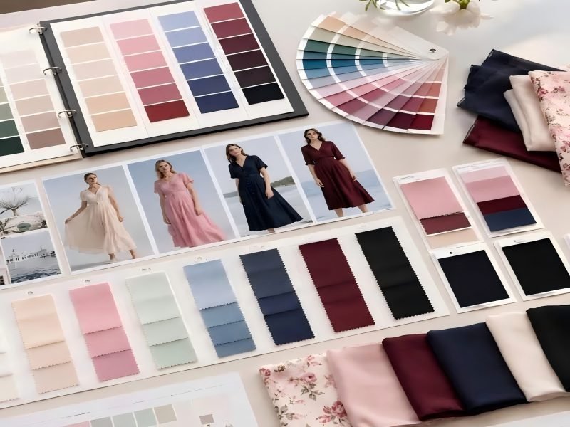
A color may occupy only one line in a tech pack, yet it can affect fabric sourcing, sampling time, trim selection, campaign photography, customer perception, repeat production, and return risk. The hard part is not choosing an attractive red, green, blue, or pink. The hard part is making sure that a designer in London, a product developer in Los Angeles, a fabric mill in China, and a garment factory all understand – and reproduce – the same color.
To use Pantone colors in apparel development, select the appropriate Pantone system, record the complete code in the tech pack, develop the shade on the intended material, approve physical lab dips or strike-offs under agreed lighting, and retain an approved standard for bulk production. The Pantone code defines the target; the approved material submission defines the production result.
That distinction prevents one of the most common development mistakes: treating a screen color or Pantone number as if it were a guaranteed fabric outcome. A deep burgundy that looks perfect on a laptop may become browner on matte crepe, brighter on polyester satin, or noticeably lighter when layered over a pale lining. One brand discovered this only after its showroom samples, campaign pieces, and production garments arrived in three visibly different shades. The original Pantone reference had never changed – but almost everything around it had.
What Is Pantone’s Role in Apparel Development?
Pantone gives designers, product teams, mills, trim suppliers, and garment factories a shared color reference. It reduces subjective descriptions such as ‘dark red’ or ‘dusty pink,’ but it does not guarantee the final fabric result. The Pantone code defines the target, while the approved lab dip, strike-off, fabric cutting, or trim sample becomes the working production standard.
What Problem Does Pantone Solve?
Color language is surprisingly imprecise. Ask five people to describe champagne, sage, wine, nude, or cobalt and you may receive five different interpretations. Pantone replaces much of that subjectivity with an identifiable code that can be recorded, shared, checked, and archived. This is particularly useful when the brand, design office, sourcing team, material supplier, and garment factory work in different countries and time zones.
A complete Pantone reference gives every party a common destination. Instead of asking a mill to create a warm burgundy, the product team can provide a specific code and suffix, attach it to a defined fabric quality, and request physical submissions. The same reference can then appear in the colorway page, bill of materials, artwork, sample request, purchase order, and approval record.
Pantone should still be treated as a communication system rather than a dye recipe. The mill must determine how to approach the target using the selected fiber, yarn, construction, dye class, finish, and production process. A code can be technically correct while the garment looks commercially wrong because the substrate is too glossy, too transparent, too textured, or too different from the material used during approval.
- What is the complete Pantone number and suffix?
- Which material or component uses the color?
- Is the code an initial target or an already approved production reference?
- Which physical standard has priority if references conflict?
- Who has authority to approve, reject, or conditionally accept the submission?
Is Pantone the Final Fabric Color?
A Pantone code is normally the initial color target, not the final production standard. Fabric absorbs, reflects, and transmits light differently from a standardized cotton or paper reference. Cotton poplin, brushed jersey, stretch satin, velvet, mesh, chiffon, lace, and sequined fabric can all produce different visual effects even when suppliers are aiming at the same code.
- The brand selects the Pantone target and assigns it to a style and material.
- The mill develops a lab dip or strike-off on the intended substrate.
- The brand reviews the physical submission and issues directional comments.
- One option is approved and retained as the material master.
- A pre-production sample is made in the approved materials.
- Bulk fabric and finished garments are compared with the retained standards.
Once a lab dip has been approved, that physical piece often becomes more useful for day-to-day production than the original Pantone chip. It shows how the target behaves on the real fabric. The Pantone code should remain in the records because it preserves the original design direction, supports future supplier changes, and helps diagnose shade drift in repeat orders.
Do Digital Colors Match Pantone Standards?
Digital color is useful for collection planning, design presentations, and quick communication, but it should not be the sole production reference. The same file can look warmer, cooler, brighter, or darker depending on screen calibration, display technology, brightness, viewing angle, color profile, and ambient light. Photographs add camera settings, white balance, editing, compression, and lighting conditions to the uncertainty.
RGB and HEX values describe color in digital displays. CMYK relates to process printing. None of them guarantees how dye will look on a textile. A digital Pantone simulation can show direction, but it cannot reproduce the texture, opacity, luster, or fiber chemistry of the intended material.
Reference | Best Use | Reliability for Textile Production |
Color name | General discussion and merchandising language | Low |
Screen image | Mood boards and early visual review | Low |
RGB or HEX | Website, app, and digital artwork | Low |
Complete Pantone code | Shared target definition | Medium to high |
Physical Pantone standard | Controlled visual comparison | High |
Approved lab dip or strike-off | Material production control | Very high |
Approved bulk cutting | Repeat-order and lot comparison | Very high |
Digital tools make development faster. Physical standards make decisions defensible when fabric, lead time, and production capacity have already been committed.
When Should Pantone Colors Be Selected?
Pantone colors should be selected after the collection palette has been established but before final material development begins. Choosing them too late can create additional sampling, missed fabric deadlines, trim shortages, custom-dye surcharges, or inconsistent colorways. Choosing them too early without considering the material can also create unrealistic expectations.
- Confirm the seasonal or collection palette.
- Assign colors to specific styles, materials, and delivery periods.
- Identify shell fabric, lining, mesh, lace, print, and trim requirements.
- Flag difficult colors, including fluorescent, very pale, very dark, or highly saturated shades.
- Check whether visible trims are custom dyed or selected from stock ranges.
- Request material-specific lab dips or strike-offs.
- Review color together with opacity, stretch, drape, lining, and garment construction.
- Lock approved standards before bulk material ordering.
For a multi-style collection, manage the color across the range instead of treating each style in isolation. One red may appear on satin, mesh, jersey, lining, embroidery, and sequins. The commercial objective is not to force every material into an impossible laboratory identity; it is to create a coordinated collection that looks intentional in product photography, on the body, and across repeat deliveries.

Which Pantone System Should You Use?
Apparel teams normally use the Pantone Fashion, Home + Interiors system for textile development. TCX is commonly used as a reference for fabrics and other soft textile surfaces, while TPG is a paper-based reference suited to many coated, hard-surface, and accessory applications. The correct system depends on the component material and the way its color is produced.
What Is Pantone FHI?
Pantone Fashion, Home + Interiors, often shortened to FHI, is the system most closely associated with fashion, textiles, interiors, and consumer-product color development. A complete FHI reference includes a number and a suffix. The suffix matters because it identifies the format or material basis of the standard being used.
A product file should not simply state 18-1664. It should record the complete reference, such as 18-1664 TCX, together with the brand’s commercial color name. The internal name remains useful in line sheets, sales systems, purchase orders, and e-commerce listings, but technical development should be controlled by the full Pantone reference and an approved physical sample.
The brand and supplier should also make sure they are comparing reasonably current and well-maintained guides. A faded or contaminated book can introduce visible differences even when both teams believe they are using the same code. Where a shade is highly sensitive, note the reference format and make the designated physical standard available to the mill or garment manufacturer.
Is TCX or TPG Better for Apparel?
TCX is generally the more relevant starting point for dyed or printed textile fabrics because it represents color on a textile surface. TPG is presented on coated paper and may be more practical for selected hard goods, coatings, accessories, packaging, and non-textile components. The decision should be made by component rather than by the broad category of apparel.
A single dress can combine a dyed shell, printed mesh, coated faux leather, painted hardware, plastic components, embroidery thread, a printed label, and paper packaging. Those materials are not colored through the same process, and one reference method will not control all of them equally well. The right question is not ‘Which system is used for dresses?’ but ‘What is this component made from, how is its color created, and what physical submission can be approved?’
Which System Fits Fabrics and Trims?
Component | Practical Starting Reference | Physical Approval |
Woven or knitted shell | FHI TCX | Lab dip or bulk cutting |
Lining fabric | FHI TCX | Lab dip |
Printed fabric | Pantone targets plus artwork | Strike-off |
Embroidery thread | Pantone target or supplier shade card | Thread cutting or embroidery sample |
Zipper tape | Pantone target | Complete zipper submission |
Metal hardware | TPG, plating reference, or finish sample | Approved hardware sample |
Faux leather / coated material | TPG or agreed surface reference | Material swatch |
Labels and hangtags | Printing Pantone reference | Printed proof |
Beads, stones, sequins | Pantone direction plus supplier range | Physical trim board |
Every visible component should also be classified as an exact visual match, tonal match, closest available stock shade, coordinated contrast, hidden component, or decorative accent. This prevents a supplier from assuming that every trim must be custom dyed to an exact match when a tonal relationship would be more reliable and commercially appropriate.
The shell fabric normally carries the highest visual priority. Other materials are then coordinated with the approved shell standard. A custom-dyed zipper or elastic may improve matching but can increase minimum quantities and add development time. A carefully approved stock shade may be a better decision when the closure is concealed, the visual area is small, or repeat availability matters more than laboratory precision.
Do Pantone Guide Versions Matter?
Pantone guides are working tools, and their condition affects evaluation. Light exposure, dust, oils from handling, humidity, and age can alter the appearance of the reference. Two teams can quote the same code while comparing against physical standards that no longer look the same.
- Record the complete Pantone code and suffix.
- Use a clean, well-maintained physical guide.
- Store guides away from direct sunlight, heat, and contamination.
- Avoid approving disputed shades from photographs alone.
- Confirm which physical reference has priority.
- Archive approved material cuttings with the style and supplier records.
- For repeat orders, compare against the previous approved bulk as well as the original target.
If a brand and mill disagree strongly about a submission, compare the physical references before demanding another dye correction. The problem may sit in the reference tools rather than the formula. For recurring colors, an approved fabric cutting from the previous production often becomes the most commercially meaningful benchmark because it reflects what the brand accepted and customers already received.

How Do You Specify Pantone Colors?
Pantone colors should be specified with the full number and suffix, brand color name, style and colorway, material application, component location, physical reference, submission requirement, and approval status. These details must remain consistent across the tech pack, bill of materials, artwork, sample comments, purchase order, and production records.
How Should Colors Appear in a Tech Pack?
A professional tech pack should make it difficult for a supplier to apply the correct color to the wrong material. The color page, bill of materials, artwork, construction callouts, and colorway overview should use one naming and coding system. If the color page says Garnet Night, the BOM says Wine, the sample request says Burgundy, and the purchase order says Dark Red, the supplier must guess whether these terms describe one shade or several.
Field | Example Entry |
Style number | DL-2487 |
Brand color name | Garnet Night |
Pantone target | 19-1655 TCX |
Material | Main stretch satin |
Supplier quality | ST-220; 95% polyester / 5% elastane |
Submission | Three lab dip options |
Trim instruction | Tonal zipper and sewing thread |
Approval standard | Lab Dip B |
Status | Approved for pre-production sample |
Approval record | Product team; 12 March |
Include the material or component beside the Pantone code. The same commercial color may need separate development for shell satin, lining, mesh, embroidery thread, and zipper tape. State the intended process – dyeing, printing, coating, plating, or stock shade selection – and define the required submission. The approval field should record who approved the item, when it was approved, and whether the decision applies to sampling or bulk production.
What Color Information Should You Send?
The information package should match the complexity of the product. A solid-dyed fabric may require a complete Pantone target, fabric quality, finish, intended use, light source, and lab dip deadline. A printed or embellished dress requires more context because color cannot be separated from artwork scale, placement, registration, coverage, base fabric, and surface effect.
- Collection color board and approved commercial color names.
- Style-color matrix showing which colors apply to which styles.
- Complete Pantone numbers and suffixes.
- Fabric and trim bill of materials.
- Composition, construction, weight, stretch, finish, and supplier quality codes.
- Original artwork, repeat dimensions, scale, color separation, and placement instructions.
- Physical reference garment, swatch, or archive standard when available.
- Primary and secondary light sources for review.
- Submission schedule and named approval contact.
- Required colorfastness, washing, rubbing, light, or migration tests where relevant.
Also explain the commercial priority. A small difference on a hidden pocket bag does not carry the same risk as a mismatch between two visible bodice panels. The supplier should know whether the brand is protecting exact campaign continuity, coordinating several materials in one garment, matching a carryover color, or seeking the most stable commercial version of a new shade.
How Should Colorways Be Organized?
Colorways should follow a consistent naming, coding, and revision system. For each style, create a component map that identifies the main fabric, secondary fabric, lining, mesh, lace, thread, zipper, elastic, hardware, embroidery, beads, sequins, and labels. State both the target shade and the matching expectation for each item.
For collection development, a style-color matrix reveals where one commercial color actually requires several material approvals. A collection may call all versions ‘Blue Dusk,’ yet the satin, mesh, jersey, lining, and embroidery thread will rarely be produced by one supplier or one dye method. Mapping them early reduces duplicate submissions and shows which styles depend on the same approved material.
Revision control is equally important. If the product team moves from a warm red to a cooler blue-red after the first sample, the revised tech pack, BOM, print file, sample comments, and purchase order should carry the same revision date. A major color change should never exist only in an email thread while the factory continues working from an earlier attachment.
Do You Need a Physical Color Standard?
A physical standard is strongly recommended whenever color affects brand identity, campaign coordination, retailer approval, set matching, or repeat production. Useful references include a Pantone swatch, original garment, approved lab dip, approved strike-off, approved fabric cutting, trim board, pre-production sample, and sealed bulk garment.
Every retained item should be labeled with the style, color name, material, supplier, date, approver, and approval scope. Approved for sample is not the same as approved for bulk. A material may be accepted temporarily so a fit sample can proceed while the final color is still being corrected. That limitation must remain visible in the records.
Unlabeled swatches create avoidable risk. Several months later, the team may not know whether a cutting was approved, rejected, or merely submitted. A simple label and signature can prevent an expensive repeat-order error. The brand, mill, and garment factory should hold matching or traceable references so that each party is evaluating production against the same decision.

How Are Lab Dips and Strike-Offs Approved?
A lab dip is a dyed-material submission used to approve a solid color, while a strike-off is a printed submission used to approve print color and execution. Both should be reviewed on the intended substrate, under agreed lighting, against the designated standard. The approval must state clearly whether the submission is accepted, conditionally accepted, or requires correction.
What Is a Lab Dip?
A lab dip is a small dyed fabric sample prepared before the mill dyes the full production quantity. Mills often submit several options because the closest hue, depth, and saturation may not appear in the same version. One option may be warmer, another darker, and another more stable under multiple light sources.
- Hue direction: redder, bluer, yellower, or greener than the target.
- Value: too light or too dark.
- Chroma: too bright, too dull, or insufficiently saturated.
- Surface appearance: matte, glossy, brushed, transparent, or reflective behavior.
- Uniformity: side-to-side consistency and visible streaking.
- Compatibility: relationship with lining, thread, zipper, lace, mesh, and hardware.
- Lighting behavior: stability under the agreed primary and secondary light sources.
- Collection position: whether the shade works beside the surrounding palette.
The lab dip should be developed on the intended or technically representative fabric quality. A shade developed on generic cotton cannot confirm how it will appear on stretch polyester satin, nylon mesh, viscose jersey, velvet, or a coated fabric. Straightforward colors may be developed within several working days, while special fibers, difficult shades, unusual finishes, or repeated corrections can take longer. The development calendar should include submission, courier, review, correction, and final approval time.
What Is a Strike-Off?
A strike-off is a trial print produced before bulk printing. It is used to evaluate the complete printed result on the intended base fabric, not only isolated color chips. The review should include the ground color, artwork scale, repeat size, placement, registration, edge definition, coverage, penetration, print hand, show-through, stretch distortion, and appearance after curing or finishing.
A floral print can use acceptable individual colors and still feel wrong because the dark tones dominate, the repeat is too large, or the base fabric changes the contrast. A design that looks balanced on opaque crepe may lose definition on mesh or appear excessively bright on glossy satin.
The approval record should state exactly what is approved. Approved for color only does not approve scale or placement. Approved for artwork only does not authorize bulk printing if the color is still open. Engineered or placement prints may also require a garment panel or sample because a flat strike-off cannot confirm how motifs interact with seams, darts, necklines, closures, and cut lines.
How Should Submissions Be Reviewed?
- Confirm the submission label, material quality, option number, and date.
- Allow the material to rest in the review environment.
- Place the sample and master standard in the same viewing plane.
- Review under the agreed primary light source.
- Check under at least one relevant secondary light source.
- Compare hue, depth, saturation, texture, opacity, and surface effect.
- Place visible trims and layered materials beside or beneath the sample.
- Assess the shade within the collection palette and intended garment construction.
- Record a clear decision, directional comments, approver, date, and light source.
- Retain a clearly identified approved standard on both sides of the supply chain.
Instrumental measurement can support the decision, but it should not replace visual judgment. A numeric pass does not guarantee that satin, mesh, thread, and zipper tape will look harmonious when sewn together. Acceptance tolerances should be agreed through the customer’s standard, test method, substrate, and end use rather than assumed to be universal.
What Should Approval Comments Include?
Status | Meaning | Example Comment | Next Action |
Approved | Suitable for intended use | Option B approved for bulk | Retain and proceed |
Conditionally approved | Accepted with a stated limit | Approved if bulk is not darker | Confirm control before production |
Closest available | Commercial compromise accepted | Approved as closest stock trim | Record limitation |
Resubmit | Direction is close but not acceptable | Reduce redness; keep current depth | Prepare corrected option |
Rejected | Wrong direction, standard, or substrate | Incorrect base quality; restart | Redevelop submission |
Useful directional comments include too red, too blue, too yellow, too green, too warm, too cool, too light, too dark, too bright, too dull, increase saturation, reduce saturation, keep the hue but increase depth, or match option A’s hue with option B’s brightness. Comments such as ‘not right,’ ‘please improve,’ or ‘looks different’ force the supplier to guess and often create another unsuccessful round.
Every approval should name the approver and date, state the light source, identify the exact option, and define the approval scope. Where design, buying, sourcing, and quality teams are all involved, one person or role should hold final decision authority. Multiple conflicting comments increase lead time and make later accountability almost impossible.

How Do Fabric and Light Change Color?
The same Pantone target can look different because fiber, yarn, texture, weave, knit structure, luster, transparency, stretch, finish, and dye chemistry change how light interacts with the material. Lighting also alters perception. Color must therefore be approved on the intended fabric, under agreed light sources, and within the actual garment construction.
Why Does the Same Pantone Look Different?
Color is never seen separately from the surface carrying it. Matte crepe scatters light and often looks flatter than satin. Satin produces bright highlights and dark folds. Velvet changes as the pile direction moves. Mesh and chiffon allow skin, lining, seam allowance, or a second layer to influence the visible shade. Brushed and textured materials create small areas of shadow that can make a color look deeper or less saturated.
Fiber chemistry also affects dye behavior. Cotton, viscose, polyester, nylon, and blends may require different dye classes and processing conditions. Two suppliers can achieve a close visual match under one light while the materials separate under another. Finish matters as well: washing, calendaring, coating, softening, resin, brushing, and heat setting can change luster and perceived depth.
Stretch is especially important in fitted apparel. When jersey or elastic mesh is extended, the structure opens, more background becomes visible, and the shade can look lighter. A bodycon dress may match perfectly on the table but look different across the bust, hip, or sleeve when the material is under tension.
- Must the materials look identical when placed side by side?
- Is a tonal relationship acceptable?
- Which component carries visual priority?
- How will the fabric look when stretched, folded, draped, or layered?
- Will the final garment be viewed over lining, padding, or skin?
- Which lighting condition controls approval?
How Do Satin and Mesh Affect Color?
Satin is highly reflective. A dark emerald satin can look vivid under direct light and almost black in shadow. A pale champagne can shift warmer or cooler according to yarn type, finishing, viewing angle, and light source. These variations may be desirable in occasionwear, but the product team must understand them before approving the shade from a small, flat cutting.
Mesh is transparent or semi-transparent. Its final appearance depends on yarn color, hole size, density, number of layers, lining color, skin tone, seam allowance, and stretch. A mesh swatch evaluated on white paper may look much lighter than the same material placed over a nude lining or worn on the body.
- Chiffon usually becomes deeper when layered.
- Velvet changes with pile direction and pressure.
- Jersey and elastic mesh may lighten when stretched.
- Lace combines yarn color with open space and the layer beneath it.
- Sequins reflect their own finish as well as the backing fabric.
- Coated fabrics can appear brighter because of surface gloss.
For color-sensitive materials, recreate the intended garment construction during approval. Place mesh over the planned lining, fold chiffon to the expected layer count, stretch jersey to a realistic wearing level, and review sequins beside the backing fabric. The approval should represent the product customers will see, not only the material in isolation.
How Should Colors Be Checked Under Light?
Color should be checked under a controlled primary light source and at least one relevant secondary source. Daylight simulation is commonly used as a broad reference. Retail lighting may matter for garments sold in stores, while warm evening lighting can be particularly relevant for partywear and occasion dresses. Brands that depend heavily on e-commerce should also consider studio photography and how reflective fabrics behave under strong directional lighting.
- Use a clean, neutral viewing background.
- Avoid mixed window and office lighting.
- Place the master and submission side by side at the same angle.
- Review visible fabrics and trims together.
- Check the material flat, folded, draped, and stretched where relevant.
- Record the primary and secondary light sources used.
- Recheck shades that shift noticeably between sources.
Office light is rarely controlled enough for final approval. Window light changes with time of day, weather, season, direction, and glass tint. The purpose of a light box is not to make a sample look better; it is to make the comparison repeatable between the brand, mill, factory, and quality team.
What Is Metamerism?
Metamerism occurs when two materials appear to match under one light source but look different under another. It is common when shell fabric, lining, zipper tape, sewing thread, lace, embroidery, elastic, plastic, and metal finishes come from separate suppliers and use different colorants.
A burgundy satin and zipper tape may look coordinated under daylight simulation. Under warm retail light, the satin may appear redder while the zipper becomes more purple. Both suppliers may have matched the target in their own conditions, yet the materials respond differently when the spectral composition of the light changes.
- Agree on the primary and secondary review light sources.
- Evaluate visible components together rather than separately.
- Share approved standards between responsible suppliers.
- Avoid last-minute substitutions in fabric, trim, coating, or finish.
- Prioritize the component with the largest or most visible area.
- Define whether the relationship must be exact, tonal, or coordinated.
- Recheck repeat orders against retained garment-level standards.
It is not always practical to eliminate every difference across satin, mesh, thread, plastic, metal, and decorative surfaces. The real goal is to prevent a distracting mismatch in the finished garment under the conditions in which customers, buyers, photographers, and retailers are most likely to see it.

How Do You Control Bulk Color Consistency?
Bulk consistency depends on locking the approved standard, identifying dye lots, inspecting individual rolls, grouping compatible shades, controlling cutting allocation, matching visible trims, and checking finished garments under agreed lighting. Repeat orders should be compared with retained approved fabric and previous bulk samples, not developed from the original Pantone number alone.
How Is the Approved Standard Locked?
An approval protects production only when it becomes a controlled reference. The brand, mill, garment factory, and quality team should know which item is the master standard: the approved lab dip, strike-off, fabric cutting, trim board, pre-production sample, sealed garment, or first approved bulk lot.
Label the master with the style, color name, material, supplier, date, approver, and approval scope. A shade approved for a fit sample is not automatically approved for bulk. A provisional acceptance issued to protect the calendar should not quietly become the permanent repeat-order standard.
- Shell fabric and secondary fabrics are approved.
- Lining, mesh, lace, and visible trims are confirmed.
- Print, embroidery, coating, or embellishment standards are locked.
- Measurements, construction, workmanship, and pressing requirements are agreed.
- Testing status and outstanding risks are visible.
- Packaging, labeling, and colorway identification are confirmed.
- Matching or traceable standards are available to the mill, factory, and inspectors.
This pre-production check prevents a sample from appearing fully approved while the bulk fabric lot, zipper color, lining shade, or print execution remains unresolved. A complete readiness decision connects color approval with the rest of the garment standard.
How Are Dye Lots and Fabric Rolls Checked?
One purchase-order color can contain more than one dye lot, and one dye lot can still show roll-to-roll, side-to-center, or beginning-to-end variation. Incoming fabric should be identified by mill, quality, lot, and roll number before it reaches the cutting room.
- Lot-to-lot and roll-to-roll shade variation.
- Side-to-center or edge-to-edge shading.
- Beginning-to-end variation within one roll.
- Streaks, barre, uneven finishing, or nap-direction effects.
- Width, weight, stretch, and surface inconsistencies that change appearance.
- Contamination, heat damage, water marks, or finishing defects.
Compatible rolls can be grouped into shade bands such as A, B, and C, or another controlled system. Cutting plans should keep panels from the same shade group together. This is particularly important for solid dark colors, long dress panels, bias-cut satin, fitted garments, and styles where large front and back panels meet across visible seams.
Bundles should retain their shade identity through cutting, sewing, repair, and replacement. A correctly grouped cutting plan can still fail if a sewing line exchanges a damaged panel with a visually different replacement from another bundle.
How Are Fabrics and Trims Matched?
Visible trims should be reviewed against the approved bulk fabric, not only against the original Pantone target. Sewing thread, zipper tape, elastic, binding, lace, mesh, embroidery, boning channels, bra cups, sequins, beads, buttons, metal hardware, and labels can all create noticeable differences.
Create a physical trim board that places the actual approved shell fabric beside every visible component. Mark each item as an exact match, tonal match, closest stock shade, intentional contrast, or hidden component. The visual risk depends on placement: a slightly different thread may be acceptable inside a seam but obvious in decorative topstitching; a stock zipper may be acceptable when concealed but distracting when exposed.
When an exact match is not practical, make the commercial decision before production. Custom-dyeing a zipper or elastic can improve coordination but may add lead time, minimum quantities, and another approval cycle. A stable tonal match is often better than an unstable attempt at false precision.
How Is Color Controlled from Sample to Repeat Production?
- Document the Pantone target, material, and matching requirement.
- Approve a lab dip, strike-off, trim sample, or surface finish.
- Review the bulk material lot against the retained master.
- Inspect and shade-group individual rolls where necessary.
- Allocate cutting by lot and shade group.
- Keep bundles and replacement panels identifiable.
- Match visible trims and layered materials at garment level.
- Check inline production for mixed panels, heat marks, contamination, and finish changes.
- Compare finished garments with the approved sample and physical standards under agreed lighting.
- Archive approved bulk cuttings, lot data, garment samples, and corrective-action records.
Finishing can alter appearance even when the original dye shade was acceptable. Pressing may create shine on satin; heat can affect prints, coatings, elastic, or sequins; washing and stain-removal treatments can change surface depth; brushing or steaming can change the direction of velvet pile. Inline and final inspections should therefore assess both shade and process-related surface changes.
When bulk color appears to fail, place the affected material or garments on hold. Confirm the correct master, fabric quality, dye lot, light source, and viewing method. Determine whether the issue affects the whole lot, selected rolls, one side of the fabric, specific panels, or a trim. Options may include shade segregation, replacement, recutting, safe reprocessing, trim reallocation, written commercial acceptance, or reproduction. The decision should consider visibility and end use; a hidden lining does not carry the same risk as two mismatched front bodice panels.
Repeat orders should begin with the retained approved standard and previous bulk history, not only the original Pantone code. Confirm whether the original yarn, fabric construction, mill, finish, dye process, and trim sources remain available. Compare the new submission with both the original target and the most recent approved bulk. One comparison protects design intent; the other protects continuity with garments already sold.
Start a Color-Controlled Apparel Project
Pantone makes color communication possible, but disciplined development makes color repeatable. The strongest results come from combining a clear target with material-specific submissions, controlled lighting, traceable approvals, shade management, garment-level review, and a retained repeat-order archive.
Duolan Apparel supports custom development for fashion dresses, occasion dresses, party dresses, fitted styles, fashion sets, and refined women’s tops. Its documented development resources include fabric and trim sourcing, lab dips, strike-offs, color-light-box inspection, print and embroidery coordination, sample development, pre-production review, and sample-to-bulk manufacturing control. These capabilities are especially relevant to color-sensitive materials such as satin, mesh, velvet, chiffon, jersey, printed fabrics, and embellished textiles.
For a practical development assessment and quotation, send your tech pack or reference sample together with the target Pantone codes, fabric direction, colorway plan, estimated quantity, size range, delivery window, and intended market. The team can review material behavior, color feasibility, trim coordination, sampling requirements, and the controls needed to move the style toward repeatable bulk production.
Share:
Our Services
Categories
Table of Contents
Here, developing fashion collections is more than manufacturing garments — it’s a collaborative process focused on transforming ideas into well-executed, market-ready products. From fabric sourcing and sample development to scalable production and delivery coordination, every stage is built to support quality, consistency, and efficient collection launches across global markets.