Skip to content
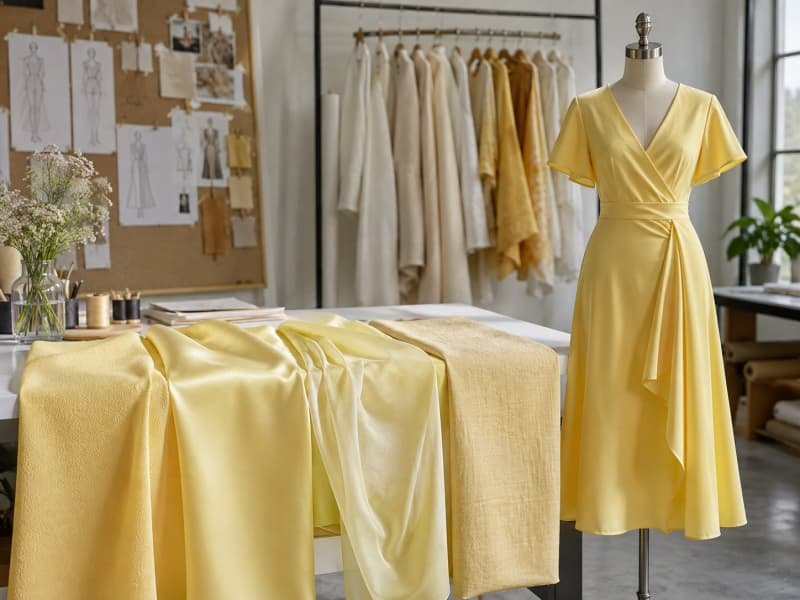
Butter yellow looks effortless when a finished dress reaches a product page, showroom rail, or campaign shoot. Behind that soft, creamy surface, however, is a surprisingly sensitive development exercise. Pale yellow can turn green under cool lighting, become overly warm beside an ivory lining, lose depth on chiffon, or expose every seam allowance beneath a fitted silhouette. A sample may photograph beautifully while the production order looks flatter because the mill changed the base cloth, yarn lot, finish, or dyeing conditions.
The most reliable butter yellow dresses begin with a physical color standard and a fabric selected for the intended drape, structure, opacity, stretch, and surface character. Consistent production then depends on approved lab dips, compatible linings and trims, identified dye lots, controlled cutting, first-piece review, appropriate testing, and retained records that make later repeat orders easier to match.
Color should never be approved in isolation. It must be judged as part of the complete dress: shell, lining, internal support, fit, trims, lighting, photography, care process, and expected selling environment. A slip dress, corset mini, linen sundress, and chiffon occasion gown may all use the same color name, yet each needs a different technical route. One production team learned this after approving a flawless satin swatch, only to discover that the chosen cup foam created visible circles beneath the first finished bodices. The fabric was not the problem; the dress had never been reviewed as a whole.
What Is Butter Yellow?
Butter yellow is a soft, creamy yellow positioned between pale lemon, vanilla, warm ivory, and muted pastel yellow. It works best when undertone, saturation, and brightness are defined with a physical reference. The name alone is not precise enough for development because mills, fibers, finishes, linings, and lighting can produce noticeably different interpretations of the same commercial color description.
Defining the Shade
Butter yellow feels warm and gentle without drifting fully into beige or cream. Compared with lemon yellow, it normally has lower saturation and less green. Compared with ivory, it contains enough yellow to remain clearly identifiable as a fashion color. Compared with mustard, it is lighter, cleaner, and less brown. Those distinctions matter because a small undertone shift can change a dress from fresh and premium to sharp, washed out, or unexpectedly old-fashioned.
A verbal description is useful for creative discussion, but it is not a dependable production standard. One supplier may interpret butter yellow as a creamy pastel, another as a sharper pale yellow, and a third as a near-ivory shade. Development should begin with an approved physical fabric swatch or recognized color reference, supported by the intended composition, surface, and viewing conditions. Digital references can help teams communicate, but monitor brightness, calibration, white balance, and ambient light make screen approval unreliable.
The reference should also match the actual product direction. A shade developed on matte cotton poplin will not behave the same way on glossy polyester satin, translucent chiffon, or ribbed knit. Satin creates brighter highlights and deeper folds, while linen scatters light and can make the same yellow look softer or greyer. For this reason, color approval should take place on the intended bulk quality, with the final lining and key trims included whenever possible.
Trend and Commercial Use
Butter yellow has commercial appeal because it sits between a statement color and a softened neutral. It adds more freshness than cream or beige without demanding the visual commitment of bright yellow. That makes it adaptable to spring and summer assortments, vacation drops, graduation collections, social-event dressing, wedding guest edits, bridesmaid programs, and refined daytime products. Its usefulness comes from flexibility rather than from novelty alone.
A visible trend does not automatically deserve space in every collection. The practical test is whether the color supports the brand’s established customer, price point, product calendar, and strongest silhouettes. A flowing chiffon maxi can present butter yellow as romantic occasionwear, while a compact ponte mini creates a sharper and more contemporary interpretation. A linen-blend sundress feels relaxed and summery, whereas duchess satin moves the shade into structured evening dressing.
Brands can test the color more intelligently through a small, coordinated edit rather than one isolated style. A useful group might contain a hero occasion dress, an easier day or vacation dress, a fitted fashion style, and a coordinating top or set. This creates several price and occasion entry points while revealing whether customers respond to the shade itself, to a particular silhouette, or to the way the color has been merchandised and photographed.
Dress Categories
Butter yellow is especially effective when the silhouette reinforces its soft, optimistic character. Slip dresses benefit from fluid movement, chiffon maxis gain depth through overlapping layers, and cotton or linen-blend styles create an easy summer identity. Graduation dresses, bridesmaid dresses, wedding guest dresses, vacation styles, refined day dresses, and party silhouettes can all work, but the construction and coverage expectations differ greatly from one category to another.
Structured products need more caution. Corset, bustier, bodycon, halter, and fitted mini dresses can look striking in pale yellow, yet the shell may reveal cup edges, boning channels, zipper tape, fusible reinforcement, seam allowances, and lining transitions. These styles require more internal engineering than the same design in black, navy, or deep red. The color does not create the construction problem; it simply makes hidden decisions much easier to see.
The final category decision should include where the dress will be worn, how much coverage the customer expects, whether the product must photograph under flash, and whether multiple garments will be compared side by side. Bridesmaid programs and coordinated event capsules demand tighter shade continuity than a limited vacation drop. A loose beach dress can tolerate natural texture and lighter coverage, while a premium event dress needs cleaner internal finishing and more deliberate lining control.
Market and Season Fit
Butter yellow is most naturally associated with spring, summer, resort, and social-event calendars, but the fabric can extend its season. Chiffon, voile, poplin, linen blends, and lightweight satin support warm-weather collections. Heavier crepe, compact knit, textured jacquard, and velvet can carry a muted version into transitional periods. The shade should be adjusted with the material; a winter interpretation often needs more depth and less translucent brightness than a midsummer dress.
Market perception is also shaped by styling and image production. Pale yellow may look optimistic and youthful in one context, but close to cream or ivory in another. Cool ecommerce lighting can reveal green undertones, warm event lighting can make the dress look golden, and a white studio background can reduce visual depth. Development teams should review the garment in daylight, target retail lighting, and the photography conditions most relevant to the launch.
Reorder strategy should be discussed before the shade is approved. If the color will remain in a continuing bridesmaid, uniform, coordinated set, or replenishment program, the fabric source and tolerance need to support future matching. A limited seasonal product sold separately has more freedom, although records should still be retained. Deciding this early helps the team select the right mill, base cloth, testing level, and acceptable commercial shade range.
Which Fabrics Work Best?
The strongest fabric choices include matte satin, charmeuse, woven crepe, chiffon, georgette, cotton poplin, linen blends, compact jersey, and ponte. Selection should follow the silhouette, opacity, drape, surface reflection, stretch, care method, target cost, and ability to reproduce the shade in bulk. A beautiful flat swatch is only useful when it also performs correctly as a finished dress.
Satin and Crepe
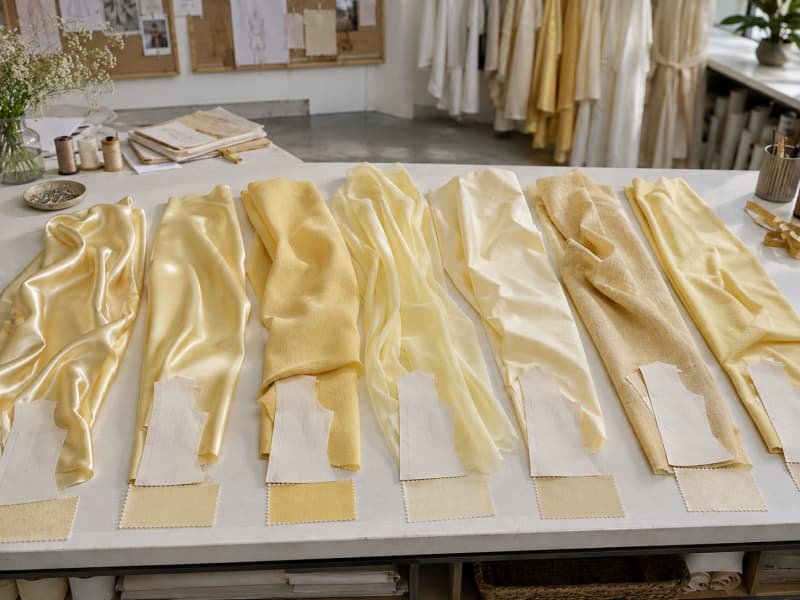
Satin gives butter yellow a polished, occasion-ready appearance, but the word satin covers several constructions with very different results. Lightweight charmeuse supports slip dresses, cowl necklines, bias-cut skirts, and fluid draping. Matte satin reduces harsh reflection and often makes the shade look creamier and more controlled. Duchess satin provides stronger body for corset dresses, fitted bodices, and fuller skirts, but its density and shine can make pale yellow feel more formal and visually substantial.
Gloss is the first concern. Highly reflective satin creates bright highlights and deep shadows, so one garment may appear to contain several yellow tones at once. Under studio flash, a soft shade can become brighter and more golden than expected. Satin also exposes workmanship: seam puckering, needle marks, pressing shine, wavy zipper insertion, uneven bias growth, snagging, and visible seam allowances are easier to see on a pale, smooth surface.
Crepe is usually more forgiving because its fine texture scatters light and gives the shade a steadier appearance. Medium-weight woven crepe works well for fitted midis, wrap dresses, occasion styles, and softly tailored silhouettes. Stretch crepe can support closer fits, provided recovery and seam behavior are tested before the pattern is approved. Low-quality crepe may feel dry, look dull, pill, or develop seam slippage, so hand feel and surface character still matter.
Chiffon and Sheers
Chiffon and georgette allow butter yellow to appear light, layered, and dimensional. They are well suited to maxi dresses, gathered skirts, flutter sleeves, draped overlays, and occasionwear. The color becomes deeper where layers overlap, which can create attractive movement but also makes the finished dress look stronger than the original single-layer swatch. Shell, lining, and secondary layers should therefore be approved as one combination rather than as separate materials.
A single chiffon layer rarely provides enough coverage for the main body. White lining can brighten and cool the yellow, ivory can add warmth, self-color lining can increase saturation, and nude lining can improve coverage while reducing color clarity. Georgette offers slightly more body and texture than chiffon, which can make it easier to control in gathered or softly fitted silhouettes. Both fabrics still need attention to grain stability, snagging, edge finishing, static, and layer balance.
Cutting and sewing methods influence the final appearance as much as the material choice. Sheer fabric can shift during spreading, distort on the grain, stretch along seams, and produce uneven gathering or hems. Pale yellow makes these differences more obvious because density changes create visible shadows. The sample should be assessed on a body or fit form, since a fabric that appears adequately covered on a table may become transparent across the bust, hips, or seat.
Cotton and Linen
Cotton and linen give butter yellow a fresh, natural identity that suits summer dresses, vacation products, shirt dresses, gathered midis, and structured sundresses. Cotton poplin provides clean shape for fitted bodices, puff sleeves, and waist-defined silhouettes. Dense qualities may need only partial lining, while lightweight poplin, voile, and eyelet often require a lined bodice, skirt lining, underlining, or strategically placed double layers.
Pure linen brings visible slubs, wrinkles, and natural variation. Those features can support a relaxed product story, but they need to be managed so garment panels do not look unintentionally mismatched. Linen-viscose blends usually offer softer drape and less stiffness, while linen-cotton blends can provide greater structure and easier sewing. Shrinkage, seam puckering after care, crease recovery, lot consistency, and lining compatibility should be reviewed before bulk fabric is released.
Natural-fiber shades can look softer than the same target on polyester because the surface absorbs and scatters light differently. Base-cloth whiteness also matters. A blue-white cotton and a warmer natural-white linen may create different undertones even when the dyeing target is similar. For repeatable production, the approved standard should identify the exact fabric quality, finish, supplier, and expected natural surface variation rather than recording only the color name.
Knits and Structure
Knits make butter yellow suitable for fitted, ruched, casual, and body-conscious dresses, but the shade can change under extension. As loops open, the fabric may become lighter, more transparent, or uneven. Lightweight jersey often needs lining or double-layer construction, while compact jersey provides stronger coverage. Ponte and double knits offer more stability for close-fitting silhouettes, although their heavier structure creates a more solid and less airy color effect.
Stretch and recovery should be tested in both directions. A fabric may extend easily yet fail to return, causing growth at the seat, waist, neckline, or hem. Variations in tension can also produce darker and lighter areas across a fitted garment. Pattern development should therefore use the exact approved material, with review at the expected wearing extension rather than only in a relaxed state. Larger sizes may need additional support or different internal construction to preserve coverage.
Structured woven fabrics remain useful for corset dresses, shaped minis, pleated silhouettes, and occasion styles that require support. Medium crepe, compact twill, jacquard, and heavier satin can all work, but stiffness should not overpower the softness of the color. The following ranges are practical development references rather than universal specifications, because yarn, fiber, construction, finish, and silhouette can make two fabrics of the same weight behave very differently.
| Fabric type | Typical weight | Suitable styles | Main checks |
| Chiffon | 60-100 gsm | Layered maxis, sleeves, overlays | Transparency, snagging, layer matching |
| Georgette | 80-140 gsm | Gathered and draped dresses | Grain stability, seams, shrinkage |
| Charmeuse satin | 90-160 gsm | Slips, cowls, bias-cut dresses | Shine, puckering, opacity, bias growth |
| Matte satin | 120-200 gsm | Occasion and bridesmaid dresses | Drape, pressing, bulk shade |
| Woven crepe | 120-220 gsm | Wrap, midi, fitted dresses | Seam slippage, recovery, surface |
| Cotton poplin | 100-160 gsm | Sundresses, shirt dresses | Shrinkage, opacity, crease recovery |
| Linen blend | 130-220 gsm | Vacation and summer dresses | Slubs, wrinkles, lot consistency |
| Stretch jersey | 180-260 gsm | Ruched and fitted dresses | Stretch, recovery, show-through |
| Ponte knit | 250-350 gsm | Bodycon and structured knits | Heat response, seam bulk, growth |
| Duchess satin | 180-300 gsm | Corset and structured occasion dresses | Support, pressing marks, seam thickness |
How Does Fabric Change the Shade?
Fabric changes butter yellow through fiber composition, base color, yarn structure, density, surface finish, texture, weight, and light reflection. The same target can look golden on satin, muted on linen, creamy on matte crepe, or uneven on sheer fabric. Color should therefore be approved on the intended production quality, together with the lining and construction that will influence the final appearance.

Fiber and Dye Behavior
Different fibers require different dye systems and do not receive or reflect color in the same way. Polyester, cotton, viscose, nylon, linen, and blended fabrics can all be directed toward one visual target, yet the final balance of warmth, brightness, and depth may differ. A successful yellow on polyester satin cannot simply be copied onto cotton poplin or viscose crepe with the expectation of an identical result.
Polyester often produces a clean and bright shade when the base fabric and dyeing process are controlled. Cotton can look softer or flatter because of its absorbent surface, while viscose may produce rich color but also requires careful wet-processing and dimensional control. Linen contains natural irregularity that can create small differences in depth. Nylon and polyester trims may also separate visually even when they appear matched under one light source.
Base-cloth whiteness is an overlooked variable. One white fabric may contain optical brighteners and appear blue-white, while another may be warmer or more natural. Pale yellow does not fully cover these differences, so the base remains part of the final color. Blends add further complexity because fibers may take dye differently, producing a two-tone effect. Any fabric substitution should therefore trigger fresh color development rather than relying on the previous approval.
Surface and Finish
Surface finish controls how light is reflected, scattered, or absorbed. Glossy satin produces sharp highlights and darker folds, while matte crepe creates a steadier visual field. Sandwashing can soften reflection, calendaring can increase smoothness and shine, peaching may add warmth and reduce brightness, and crinkle finishing creates irregular shadows. Two rolls with similar measured color may still look different if their surface and hand are not consistent.
Finishing processes such as brushing, coating, enzyme washing, heat setting, softening, mercerizing, or calendaring can change the apparent shade as well as the handle. This is especially important when sample fabric and bulk fabric are finished on different equipment or in separate lots. Approval should include both color and surface character, since a glossier replacement can look brighter even when a color instrument reports only a small numerical difference.
Pressing during garment production is another finishing stage. Excessive temperature, pressure, steam, or dwell time can create glazing, flattened texture, seam impressions, or local shade differences. Pale yellow reveals pressing marks quickly because damaged areas reflect light differently. Sample development should establish the appropriate pressing method, including protective cloths, vacuum, steam level, and cooling time, before operators begin the production order.
Weight and Texture
Fabric weight affects how much background light passes through the material. A lightweight quality can appear pale as a single swatch yet become richer when layered over a lining. Dense fabrics create a more solid color but may also make the shade feel heavier and less delicate. Weight alone is not a complete guide, because weave density, yarn type, and finish determine opacity as much as the gram-per-square-meter figure.
Texture distributes color unevenly by design. Ribbed knits create darker channels and lighter raised areas. Pleated fabric looks deeper inside folds. Crinkle surfaces produce irregular highlights, while eyelet, embroidery, mesh, sequins, and jacquard introduce local differences in density and reflection. These effects can add character, but they should be anticipated during product development rather than treated as unexpected color inconsistency after the sample is made.
The most useful review looks beyond a flat swatch. Fabric should be assessed folded, layered, gathered, pleated, stretched, and draped vertically over the intended lining. A ruched bodycon dress may look considerably deeper than the original material because several layers overlap. A chiffon sleeve can remain almost transparent while the lined bodice looks strong and saturated. Three-dimensional review reveals how the customer will actually see the shade.
Lighting and Lining
Butter yellow can shift noticeably under different light sources. Warm indoor light may make it creamy or golden, while cool LED light can reveal a green cast. Shell fabric, lining, zipper tape, thread, elastic, cups, and decorative trims may appear matched in one environment and separate in another. This metamerism is common when components use different fibers, dyes, and surface finishes.
Lining has a direct visual effect because many pale fabrics are partially translucent. White can brighten and cool the shell, ivory can increase warmth, nude can improve coverage while reducing color clarity, and self-color lining can strengthen saturation. The most suitable option depends on the desired appearance, skin-tone coverage, shell density, and occasion. Lining should be reviewed in the complete garment rather than selected from an isolated swatch card.
Ecommerce photography adds another variable. Background color, exposure, white balance, camera settings, and retouching can change how the product appears online. The factory target should remain the approved physical standard, while the photography team should represent that garment accurately. Using a heavily edited campaign image as a new production reference often creates confusion because the digital file may no longer show the true fabric color.
| Variable | Likely visual effect | Practical control |
| Cool LED lighting | Shade may appear greener or sharper | Review under daylight and target retail lighting |
| Warm indoor lighting | Shade may appear creamier or more golden | Compare with the approved physical standard |
| White lining | Shell looks brighter and cooler | Review as a complete layered combination |
| Ivory lining | Adds warmth and depth | Confirm the dress does not appear beige |
| Nude lining | Improves coverage but can reduce yellow clarity | Test across relevant skin tones |
| Self-color lining | Strengthens yellow saturation | Approve shell and lining together |
| Gloss finish | Creates stronger highlights and shadows | Review under movement and studio flash |
| Matte finish | Creates a softer, more even appearance | Check that the shade does not become dull |
| Stretching | May lighten color and increase transparency | Review at expected garment extension |
| Multiple sheer layers | Deepens color in overlapping areas | Approve the complete garment construction |
How Should the Dress Be Engineered?
A butter yellow dress should be engineered around opacity, lining, stretch, seam visibility, fit, and internal support. Pale fabric exposes construction more easily than dark fabric, so cups, boning, pockets, zipper tape, facings, labels, and seam allowances must be evaluated from the outside. The complete garment should be tested under movement, tension, realistic lighting, and photography before bulk production begins.

Lining and Opacity
Not every butter yellow dress requires full lining, but every design needs an opacity plan. The decision should consider fabric density, silhouette, fit, body coverage, customer expectations, climate, selling price, and intended occasion. A loose cotton sundress may need only a lined bodice or skirt, while a chiffon maxi normally requires lining through the main body and a close satin mini may need underlining to reduce seam shadows.
Lining improves coverage and can make internal construction cleaner, but it also adds cost, weight, heat, sewing time, and possible static. A heavy lining can pull on lightweight chiffon, while a non-stretch lining can restrict a bodycon dress. A lining that ends at the wrong position may create a visible horizontal edge. The choice must preserve the shell’s intended drape and movement rather than solving transparency at the expense of fit.
Useful options include full lining, skirt-only lining, bodice lining, underlining, double-layer shell fabric, built-in briefs, modesty panels, cup coverage, and localized backing behind pockets or closures. Opacity should be checked while the dress is standing, walking, sitting, bending, and stretching, with light coming from both the front and behind. Bust, waist, hips, seat, and upper thigh deserve separate review because coverage changes under tension.
Pattern and Fit
The pattern must respond to fabric behavior. Pale yellow highlights drag lines, uneven tension, twisting seams, excess fullness, and poor balance, so a garment can look less refined even when the measurements appear technically close. Fitted dresses need enough stretch and recovery to maintain shape without becoming transparent. The sample should be evaluated at the bust, waist, hip, seat, and thigh in both static and moving positions.
Bias-cut satin requires careful grain control and time to relax before the hem is finalized. Some sections may grow more than others, and side seams can twist if spreading or cutting is inconsistent. Halter and backless dresses need stable edges, balanced neckline tension, and secure support. Corset and bustier styles require controlled cup position, bust volume, waist placement, boning length, and skirt balance rather than simply following a flat specification.
Grading should preserve the silhouette and coverage across the size range. A construction that works in the sample size may become too transparent or structurally weak in larger sizes if cup volume, strap width, lining support, elastic tension, and panel proportion are not reconsidered. A dress is not production-ready because it looks correct in one standing photograph; it must fit, move, and maintain its intended appearance across the approved sizes.
Internal Support
Internal support is easier to see beneath pale fabric. Cup foam, boning channels, underwires, fusible reinforcement, elastic, seam tape, and padding can create outlines or shaded areas. Corset and bustier dresses are particularly sensitive because a thick cup can produce a visible circular edge, dark foam can change the shell color, and boning channels can appear as vertical shadows even when the outer stitching is clean.
Possible solutions include thinner or better-matched cups, underlining, increased shell density, adjusted seam placement, narrower reinforcement, softer fusible materials, localized double layers, and more controlled pressing. Support should not simply be removed to improve appearance, because the garment still needs to hold its shape and fit securely. The objective is to maintain function while reducing visible transitions beneath the shell.
Backless dresses may need concealed elastic, internal waist stays, adjustable straps, or carefully positioned closures. Halter dresses require balanced neck tension so the garment’s weight does not pull uncomfortably. One-shoulder styles need enough internal stability to prevent rotation. These features should be assessed in direct light and photography, because components that seem acceptable in a fitting room can become obvious under flash or high-contrast ecommerce lighting.
Trims and Seams
Every visible and hidden component influences the finished color and quality. Sewing thread, zipper tape, elastic, labels, pocket bags, facings, and lining should be selected with the shell rather than treated as generic components. Thread that looks acceptable indoors may appear too white, orange, or green in daylight. An invisible zipper can create a darker line if its tape or coil is visible through a lightweight shell.
Seam construction should match the material. Satin may require fine needles, controlled stitch density, reduced tension, and careful feeding. Chiffon needs narrow, clean finishing without excessive bulk, while stretch fabrics require seams that extend without breaking or forming ridges. Pressing is part of garment engineering, not merely final presentation. Temperature, steam, pressure, dwell time, vacuum, protective cloth, and cooling should be established during sampling.
A first production piece or short pilot run is especially useful for pale satin, mesh, corsetry, complex lining, backless construction, and close-fitting dresses. It confirms that the approved sample can be reproduced with bulk fabric, production machinery, real operators, and actual pressing conditions. Finding a visible cup edge or zipper shadow at this stage is manageable; finding it after thousands of garments have been completed is considerably more expensive.
| Component | Common risk | Development control |
| Sewing thread | Looks too white, orange, or green | Approve under several light sources |
| Invisible zipper | Tape or coil shows through shell | Test inside the complete garment |
| Bra cups | Cup edge appears as a circle | Review color, thickness, and placement |
| Boning | Channels create vertical shadows | Test reinforcement and underlining |
| Elastic | Visible through neckline or back | Match color and confirm recovery |
| Pocket bags | Rectangular shapes show through skirt | Use matched lightweight fabric or remove |
| Fusible | Edge lines or adhesive dots appear | Conduct fusing trials before bulk |
| Labels | Print or backing shows through shell | Change placement or backing color |
| Seam allowance | Uneven shadows appear along seams | Standardize width, trimming, and pressing |
| Lining hem | Horizontal line visible from outside | Adjust lining length and shell density |
How Is Bulk Color Controlled?
Bulk color is controlled through approved lab dips, defined viewing conditions, fabric-lot identification, roll inspection, shade grouping, panel matching, first-piece approval, and retained references. Testing should confirm that the shade withstands care, rubbing, perspiration, light, pressing, and normal wear. Repeat orders require archived fabric, trim, and process records rather than relying on the words butter yellow alone.

Lab Dips and Approval
Color development should begin with one clearly identified master standard. This may be a physical fabric swatch, a recognized color reference, or an approved garment. Comments such as warmer, creamier, less lemon, or slightly deeper help refine submissions, but they do not replace a physical target. Each lab dip should be coded so the selected option, rejected options, and later bulk comparison remain traceable.
The review should cover hue, depth, saturation, surface character, and compatibility with lining and trims. Pale fabric should be folded into several layers because one layer may not represent the finished garment. Visual assessment is essential, while instrumental color data can support control when the brand or test protocol requires it. Similar readings do not always mean an identical appearance because gloss, texture, translucency, and metamerism can influence what the eye sees.
Approval records should identify the master reference, supplier, fabric quality, composition, weight, construction, lab-dip code, viewing lights, accepted comments, date, and approving person. A commercial shade range may be agreed, but the tolerance should reflect the product. Dresses intended to be worn together, such as bridesmaid styles, require tighter visual control than an individual textured linen style sold as a separate seasonal product.
Fabric Lots and Cutting
Bulk fabric should remain traceable by supplier, quality, color, and dye lot. Rolls from different lots should not be mixed without evaluation, and variation may still occur from one side of a roll to the other or from beginning to end. Inspection should record roll identity, usable width, visible defects, shade, finish, hand feel, and any shrinkage or relaxation behavior relevant to cutting.
Shade grouping is particularly important for pale, smooth fabrics. Rolls that appear slightly warmer or cooler should be separated, and all panels within one garment should come from compatible fabric. Replacement cutting must follow the same rule rather than using the first available offcut. Stretch knits, viscose fabrics, and compressed materials may also need controlled relaxation before cutting so dimensions and shade appearance stabilize.
The cutting room should control face direction, nap or shine direction, lot separation, panel orientation, marker placement, bundling, and replacement-panel sourcing. Satin can look different when panels are cut in opposite directions because light reflects differently across the surface. Unless the design intentionally uses contrast, visible panels should follow one controlled direction. Good color management can be undone quickly if cutting and bundling lose lot traceability.
Testing and Production Checks
Testing should follow the fabric composition, care instructions, garment use, target market, and brand requirements. Pale yellow dresses deserve careful review for fading, staining, transparency, seam behavior, and trim compatibility. Colorfastness methods often use a grey-scale rating from 1 to 5, with 5 representing the strongest performance, but the required pass level depends on the specific test, material, market, and customer standard.
The sample-to-bulk chain should remain clear from the approved standard through the fabric quality, lab dip, development sample, fit sample, pre-production sample, bulk inspection, first production piece, inline inspection, and final shipment reference. When a sample uses substitute fabric, that limitation should be recorded. Otherwise, teams may approve a visual result that cannot be reproduced once the actual production material is introduced.
Inline review should compare production garments against the approved reference for color, measurement, construction, lining, pressing, and overall appearance. Early checks are especially important for smooth satin, layered chiffon, fitted jersey, and structured pale dresses. A small shade or pressing issue identified after the first production bundle can often be corrected. The same issue discovered during final inspection may require sorting, rework, or replacement across the full order.
Repeat Orders
Repeat orders are difficult because the original fabric may no longer be technically identical. A mill may use a new yarn lot, a different base cloth, revised finishing chemicals, or updated machinery. Even when the original dye recipe remains available, the shade may not reproduce perfectly. Continuity of supplier and base quality is often more important than the color formula alone, because the same recipe on a different substrate can look noticeably different.
A useful repeat-order file should retain the approved shell and lining swatches, fabric specification, supplier and mill details, composition, weight, construction, finish, lab-dip reference, bulk dye-lot record, thread and zipper references, trim approvals, test reports, pre-production sample, and final shipment sample where practical. The brand should also state whether the new order must coordinate directly with previous stock or can stand as a separate seasonal production.
Retained standards need suitable storage because sunlight, heat, humidity, dust, and handling can change color over time. Samples should be protected, dated, and periodically checked. When an old reference is no longer reliable, a new master may need to be established from confirmed inventory or a newly approved standard. Good records do not eliminate all variation, but they turn repeat development from guesswork into a controlled comparison process.
| Control area | What is checked | Commercial reason |
| Wash colorfastness | Shade change and staining | Prevents fading and transfer during care |
| Dry and wet rubbing | Surface color transfer | Protects bags, seats, and other garments |
| Perspiration fastness | Shade change and staining | Important for fitted and event dresses |
| Light fastness | Fading or undertone shift | Pale yellow can lose warmth or depth |
| Dimensional stability | Length and width change | Protects fit, hem, and lining balance |
| Seam performance | Slippage, puckering, breakage | Important for satin, crepe, and fitted styles |
| Stretch recovery | Growth after extension | Protects bodycon fit and coverage |
| Pilling and abrasion | Surface deterioration | Affects appearance after wear |
| Snag resistance | Pulled yarns or loops | Important for satin, chiffon, and mesh |
| Pressing response | Glazing, shine, color marks | Prevents production damage |
| Trim compatibility | Bleeding, migration, heat reaction | Keeps components visually coordinated |
| Garment opacity | Coverage during movement and stretch | Reduces complaints and returns |
Butter yellow is not difficult merely because it is yellow. It is demanding because it is pale enough to reveal nearly every decision made underneath it: base-cloth variation, low opacity, visible seam allowances, mismatched linings, poorly chosen cups, pressing marks, uneven cutting direction, and dye-lot differences. When color, material, structure, and production control are considered together, the result can feel clean, warm, premium, and commercially dependable rather than fragile or inconsistent.
For a butter yellow dress program, prepare the tech pack or reference sample, target shade, intended fabric direction, size range, expected order structure, launch date, care requirements, and target market. Duolan Apparel can review fabric behavior, lining and opacity, pattern structure, trim coordination, lab dips, sample construction, testing needs, and the practical route from prototype to repeat production. Early technical review is often the simplest way to protect both the creative intention and the bulk result.