Skip to content
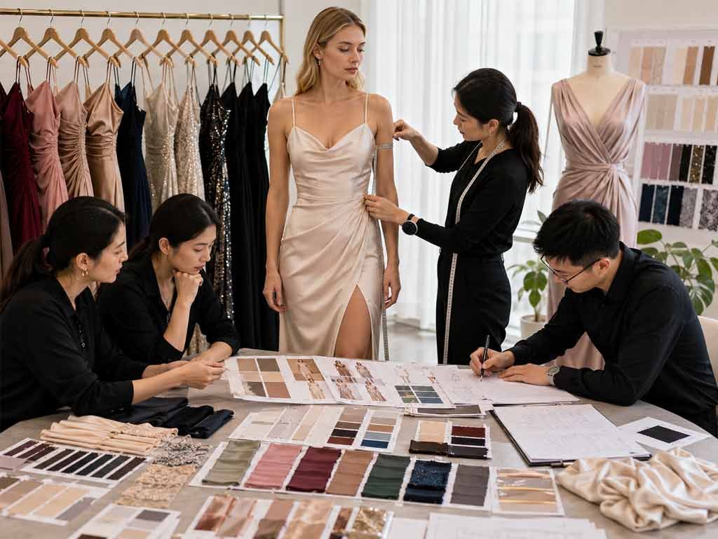
Satin can make an ordinary color feel cinematic. A blue swatch that looks calm on a desk can become almost electric once it moves across a bias-cut skirt, while a familiar brown can look deep, polished and unexpectedly modern on a structured midi dress. That is why a useful 2027 color forecast cannot stop at naming fashionable shades. It must also consider fabric luster, silhouette, lining, event lighting, photography and the commercial role each color is expected to play.
The leading satin dress colors for 2027 are Luminous Blue, expressive pinks and reds, warm yellows, living greens, clay and grounded browns, supported by dependable black, navy, champagne and burgundy. The strongest collections will use a small number of forecast-led shades alongside proven colors, then validate every choice on the intended satin, silhouette and lighting conditions.
Current forecasts point toward an interesting tension between vivid, digitally charged color and shades drawn from nature, minerals and emotional comfort. That contrast suits satin because the fabric can turn one hue into several visible tones as it catches light. Imagine a product meeting with twelve beautiful swatches spread across the table. All twelve may look tempting, but only four may suit the planned dresses, selling seasons and price position. The real advantage comes from knowing which four deserve development time, photography and inventory.
What Satin Dress Colors Will Lead 2027?
Luminous Blue, bright pink-red shades, warm yellows, Meadowland and Biotic greens, Clay and modern browns are the clearest 2027 directions. Commercial satin ranges will still rely on black, navy, champagne and burgundy. A forecast shade becomes useful only when its undertone, luster, silhouette and intended occasion fit the brand’s established customer and collection identity.
Luminous Blue
Luminous Blue is the clearest headline color in the current forecast cycle. WGSN and Coloro named it their Colour of the Year for 2027 and identify it with Coloro code 125-28-38. Their Spring/Summer 2027 group also includes Energy Orange, Pop Pink, Meadowland Green and Clay, placing a vivid blue at the center of a palette that moves between digital brightness and natural grounding.
Satin gives this blue unusual range. On a fluid maxi dress, bright highlights and deep folds can create an aquatic effect; on a corseted mini or fitted midi, the same family feels sharper and more graphic. The safest development route is not to place one intense blue on every silhouette. A campaign style can carry the strongest version, while commercial cobalt, softened aquatic blue and deep navy build a broader family with more wearable choices.
Warm Yellows
Yellow is moving away from cold lemon and purely acidic tones toward warmer, softer versions. Premiere Vision highlights Yellow Foam within its Spring/Summer 2027 direction, alongside a wider range that balances luminous energy with gentler shades. In practical dress development, that shift can translate into butter yellow, maize, warm vanilla, pale gold and softened ochre rather than one literal forecast color.
These yellows can work well for graduation dresses, spring formal styles, vacation maxis and modern wedding-guest pieces, but they need disciplined testing. Pale satin can expose seam allowances, labels and lining contrast, while excessive shine can make a warm yellow look brighter and cheaper than expected. A sound lab-dip round usually includes the target, a slightly warmer option and a slightly deeper option, all reviewed on the final satin quality under daylight, warm indoor light and photography conditions.
Pinks and Reds
Pinks and reds are becoming broader rather than following one narrow trend. Pop Pink provides a clear high-energy direction, while cooler light pinks, raspberry, cherry, ruby and wine cover different occasions and price positions. A pale iced pink may support bridesmaid or graduation dresses, while raspberry and Pop Pink fit party and homecoming collections. Ruby, wine and burgundy continue to bring depth to evening and holiday ranges.[1][3]
Undertone matters more than the color-family name. An orange-based red feels warm and direct, while a blue-based red usually appears deeper and more formal. Pale pink can move toward lilac under cool light or toward peach under warm light. Saturated color also needs visual restraint. A bright pink satin mini with crystals, cutouts, ruching and heavy shine can become overloaded, while the same color on a clean one-shoulder dress may look confident and expensive.
Greens, Earths and Core Neutrals
Green is expanding beyond familiar sage and emerald. Meadowland Green offers a fresh medium direction, while Premiere Vision’s Biotic Green brings a more organic, living quality. At the same time, Clay and Elementary Brown give satin a grounded route into contemporary neutrals. Fresh greens suit spring occasionwear, sage remains useful for coordinated events, olive bridges seasons, and emerald or forest green continues to serve evening and holiday dressing.[1][2][3]
Brown deserves more attention than it often receives. Cocoa, espresso, cinnamon and soft chocolate can make satin look refined when the fabric has controlled luster and enough body to avoid appearing flat. These earth tones also balance brighter blues, pinks and yellows within a collection. Black, navy, champagne and burgundy remain essential because forecasts describe future attention, not guaranteed sales. In many ranges, a directional shade attracts the first click while a polished neutral earns the repeat order.
| 2027 direction | Reference or interpretation | Strong dress uses | Commercial role |
| Luminous Blue | Coloro 125-28-38 | Prom, evening, party, fitted midi | Hero or campaign color |
| Energy Orange | Coloro 018-57-34 | Vacation, party, social-event styles | Limited statement color |
| Pop Pink | Coloro 151-73-22 | Homecoming, birthday, mini, party | Fashion statement |
| Meadowland Green | Coloro 050-61-19 | Wedding guest, summer occasion, maxi | Seasonal fashion color |
| Clay | Coloro 014-60-13 | Resort, contemporary midi, event dressing | Transitional commercial color |
| Yellow Foam family | Butter, maize, pale gold | Graduation, spring formal, vacation | Soft seasonal color |
| Biotic Green family | Organic medium-to-deep green | Evening, draped midi, transitional styles | Directional color |
| Elementary Brown family | Cocoa, grounded chocolate | Fall occasion, fitted maxi, evening | Modern core |
| Ruby or burgundy | Deep blue-red family | Holiday, party, formal, evening | Reliable statement |
| Black or navy | Deep neutral | Cocktail, prom, formal, evening | Permanent core |
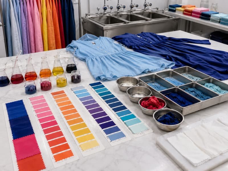
Which Satin Colors Work by Season?
Spring and summer favor Luminous Blue, warm yellow, fresh green, iced pink and pale clay, while fall and winter give more space to ruby, burgundy, chocolate, forest green, aubergine and midnight blue. Dusty rose, olive, taupe and deep champagne can bridge several launch periods when fabric weight, styling and the actual selling market are considered together.
Spring and Summer
Spring and summer colors must survive more than bright daylight. They also need to remain clear in ecommerce photography, outdoor event images and lightly styled product pages. Luminous Blue, aquatic blue, iced pink, warm yellow, Meadowland Green and light clay all fit the wider 2027 direction. Their strength comes from combining freshness with enough substance to avoid looking like a purely pastel story.
A light assortment still needs contrast. Pale blue, blush, champagne and butter yellow can look attractive individually but predictable when placed together. One saturated color, such as Luminous Blue or Pop Pink, gives the range a focal point, while clay, cocoa or olive keeps the assortment grounded. Silhouette changes the message as well: warm yellow on a cowl-neck maxi feels relaxed, while the same color on a corseted mini becomes younger and more event-driven.
Fall and Winter
Fall and winter do not require brands to abandon the brighter 2027 colors. They can be deepened instead. Luminous Blue can move toward sapphire or midnight, Pop Pink toward raspberry or magenta, Meadowland Green toward bottle or forest, and Clay toward russet, cinnamon or chocolate. This keeps the seasonal story connected without forcing the same exact shade into every launch window.
Darker satin needs as much care as pale satin. Medium- and heavier-weight qualities create broader highlights and can give burgundy, emerald, brown and black more physical presence. They also reveal construction. Puckered seams catch light as broken lines, pressing marks become obvious, and adjoining panels cut in opposing directions can appear to be different colors. Rich winter color depends on controlled cutting, seam tension and finishing, not only on the dye recipe.
Transitional Shades
Transitional colors reduce the need to rebuild an entire palette between drops. Dusty rose, muted blue, olive, warm taupe, deep champagne and soft chocolate can sit in late-summer, autumn, holiday and early-spring ranges. They work because they do not depend on one obvious weather story and can take on a different mood when paired with a lighter slip dress, a long-sleeve midi or a structured evening silhouette.
Their operational value can be equally important. One approved dusty rose may be used across several styles and selling moments, giving merchandising a recognizable thread and simplifying reorder decisions. Exact matching is not always realistic when one style uses stretch satin and another uses a lightweight woven satin. Product teams should decide whether the garments must match closely when worn together or simply remain within the same tonal family.
Regional Timing
A seasonal palette should be built around the selling calendar, not the weather at the manufacturing location. A dress developed in summer may be delivered for a Northern Hemisphere holiday launch or a Southern Hemisphere spring event season. Prom, homecoming, graduation, wedding season and resort travel also create color demand at different times, which means an energetic blue can be a summer shade in one collection and a formal-event shade in another.
Forecasts are most useful when they shape the test rather than dictate the volume. Historical sell-through, onsite color-filter use, product-page conversion, return comments and wholesale feedback provide stronger evidence for regional allocation. A forecast may justify sampling warm yellow or bright blue, but market behavior should determine the initial order depth, size distribution and whether the shade deserves replenishment after launch.
| Selling period | Useful color families | Suitable satin character | Typical applications |
| Early spring | Iced pink, pale blue, warm yellow, light sage | Soft sheen; light to medium weight | Graduation, bridesmaid, midi |
| High spring | Luminous Blue, meadow green, champagne | Fluid or matte-back satin | Formal, wedding guest, party |
| Summer | Aquatic blue, warm yellow, orange, clay | Lightweight with adequate opacity | Halter, vacation, backless, maxi |
| Transitional | Dusty rose, olive, taupe, deep champagne | Medium weight; restrained shine | Occasion midi, cowl, one-shoulder |
| Early fall | Cocoa, russet, ruby, forest green | Medium weight with richer surface | Cocktail, fitted midi, long sleeve |
| Holiday and winter | Burgundy, emerald, aubergine, midnight, black | Structured or fluid evening satin | Party, gala, formal maxi |

Which Colors Suit Each Occasion?
Prom and party ranges can support Luminous Blue, ruby, emerald, Pop Pink and black. Bridesmaid and wedding-guest collections usually benefit from coordinated shades such as iced pink, sage, dusty blue, clay and champagne. Vacation dresses can carry warm yellow, aquatic blue, orange and fresh green. The right choice depends on event formality, lighting, photography and repeat-wear expectations.
Prom and Homecoming
Prom and homecoming colors must communicate quickly. Customers often compare many dresses through small product images, social posts and group photographs, so the shade needs to register before the viewer studies neckline, fit or construction. Luminous Blue, cobalt, ruby, emerald and bright pink can create that immediate recognition, while black, navy, wine and dark green serve customers seeking a more traditional formal appearance.
Color intensity should be balanced against design complexity. A bright blue dress may need little more than a clean drape, sculpted bust or asymmetric seam to feel distinctive. Adding crystals, cutouts, heavy ruching and a glassy surface can weaken the result by creating too many competing signals. A practical range usually includes a small group of campaign colors, a larger group of wearable statement shades and a dependable base of dark colors that can carry steadier size-level demand.
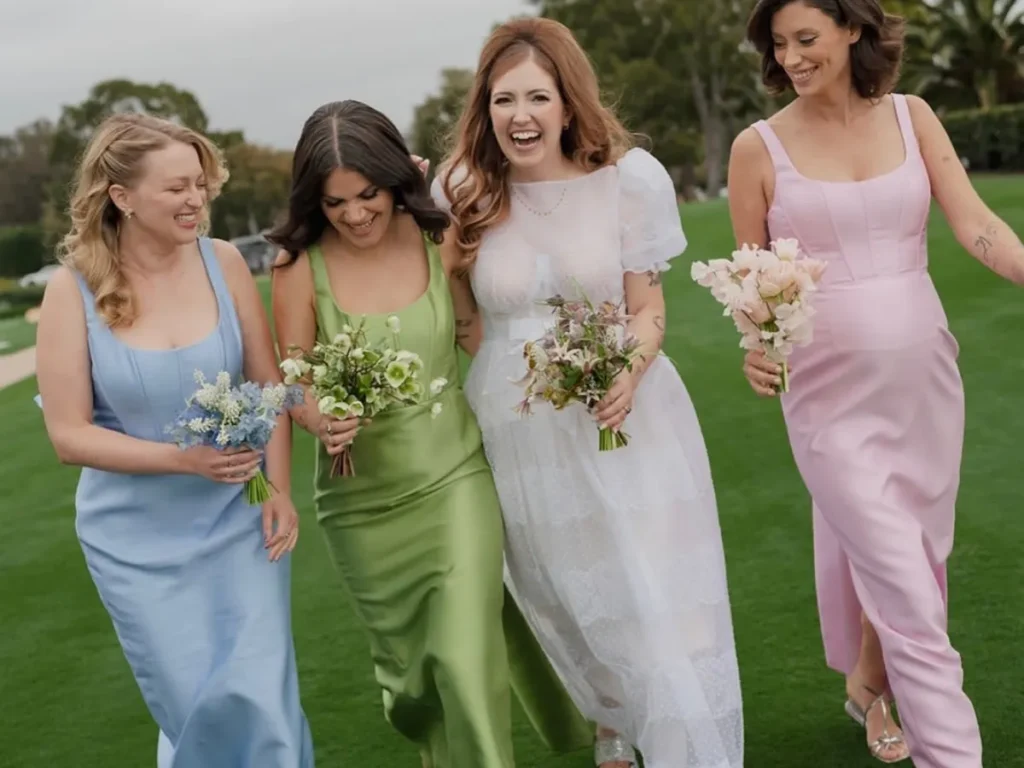
Bridesmaids and Wedding Guests
Bridesmaid palettes need discipline because several dresses may be photographed and worn together. Iced pink, sage, dusty blue, clay, taupe and champagne can move across slip dresses, halter maxis, cowl-neck midis and more covered silhouettes without losing the coordinated effect. The main technical challenge appears when different styles require different fabrics, since stretch satin and fluid woven satin can reflect the same dye target in visibly different ways.
Wedding-guest collections can be more expressive. Meadow green, raspberry, warm yellow, blue, chocolate and deeper champagne offer event-ready color without depending only on black. Regional expectations still matter, particularly around pale shades that may look too close to ivory. For both categories, production samples should be photographed outdoors and under warm indoor light, because a shade that looks elegant in a showroom may wash out in daylight or shift noticeably under reception lighting.
Party and Evening
Party and evening collections can carry the widest range of saturated satin colors because the garments are designed for movement, artificial light and social photography. Pop Pink, Energy Orange, Luminous Blue, ruby and emerald can create strong visual moments, while midnight, black, chocolate and aubergine provide a quieter form of drama based on depth rather than brightness.
The silhouette determines how much intensity the garment can support. A glossy orange mini with cutouts and dense embellishment has a narrow aesthetic margin, while a draped one-shoulder dress in the same family may look cleaner because the color and fabric become the main features. A complete evening assortment also benefits from tonal contrast. Iced pink, silvered blue or champagne can prevent a category page filled with dark jewel shades from feeling visually heavy.
Resort and Vacation
Vacation color works best when it suggests light, water, landscape and movement. Aquatic blue, Luminous Blue, warm yellow, Energy Orange, Meadowland Green and clay can create a destination mood without relying on obvious tropical prints. The 2027 combination of energetic color and grounded natural shades is especially useful because it allows a resort story to feel vivid without becoming visually chaotic.
Fabric choice must support the setting. Very pale lightweight satin can become transparent in direct sunlight, while dark high-shine satin may feel heavy on a loose summer silhouette. The fabric needs enough density to resist clinging and seam distortion while remaining fluid. Repeating one approved blue, yellow or clay family across dresses, skirts and refined tops can create a cohesive destination collection without introducing an excessive number of fabric orders and dye approvals.
| Occasion | Directional 2027 colors | Reliable alternatives | Main development concern |
| Prom | Luminous Blue, ruby, emerald, Pop Pink | Black, navy, burgundy | Impact under event lighting |
| Homecoming | Bright pink, blue, red, warm yellow | Black, wine | Strong color without excessive shine |
| Bridesmaid | Iced pink, sage, dusty blue, clay | Champagne, taupe | Consistency across styles and dye lots |
| Wedding guest | Meadow green, blue, raspberry, brown | Navy, deep champagne | Refined distinction and regional suitability |
| Party | Pop Pink, Energy Orange, cobalt, red | Black, chocolate | Photography and surface quality |
| Evening or gala | Sapphire, ruby, forest, aubergine | Midnight, black, burgundy | Drape, depth and workmanship |
| Resort or vacation | Aquatic blue, yellow, orange, fresh green | Sand, clay, ivory | Opacity and sunlight performance |
How Does Satin Change Color Appearance?
Satin changes color through reflection. Its smooth surface creates bright highlights beside deeper moving shadows, so one shade can appear lighter, darker or more saturated as the garment moves. Fabric weight, fiber, finish, grain direction, stretch, lining and lighting all influence the result. Color should be approved on the final satin and silhouette, not only from a screen or paper card.
Shine and Finish
Satin is a weave structure rather than one single fiber. Its long surface floats create the smooth, lustrous face that makes color appear dimensional, while also making the fabric more sensitive to snagging, seam slippage and handling marks. Polyester, silk, acetate and blended satins can each produce a different balance of shine, drape and color depth, even when the nominal color is similar.
A restrained or matte-back finish reduces the contrast between highlight and shadow, which can make dusty pink, clay, champagne, olive and chocolate appear softer. High-shine satin creates stronger movement and can make blue, red, emerald and black look almost liquid. It also exposes creases, pressing marks and seam puckering. Finish should therefore be selected before the final color approval; the same hue can feel like a different product when moved from a soft-luster surface to a glassy one.
Weight, Drape and Stretch
Lightweight satin forms many small folds, creating frequent shifts between brightness and shadow. Heavier satin forms broader planes that can make a shade look deeper and more stable. Bias-cut slips and draped maxis usually benefit from fluidity, while corseted dresses, fitted midis and sculpted minis need enough body to support the line without collapsing around seams or internal structure.
Stretch introduces another visible change. Fabric pulled over the bust, waist or hip can appear lighter and shinier than the same material at rest, especially in pale colors and body-conscious styles. A color review should therefore include the fabric under realistic tension. When a style moves to a different satin weight or stretch level after approval, the pattern and the visible color distribution both need reassessment rather than a simple material substitution.
Lighting and Photography
Satin can look noticeably different in daylight, warm indoor light, cool retail light and flash photography. Warm lighting strengthens yellow, orange, clay, champagne and warm red, while cooler lighting can intensify blue and green and make some beige or pink shades appear greyer. The viewing angle also matters because the reflected highlight travels across the surface as the wearer and observer move.
A consistent viewing environment makes approval more reliable. AATCC EP9-2025 provides a standardized procedure for visually comparing textile specimens with a reference and describing the difference.[6] In day-to-day product development, the most useful review includes flat fabric, hanging drape, folded fabric, the complete dress on a form or model, and photographs in the expected selling conditions. A small lab dip alone cannot reveal what happens across curved seams, gathers and moving skirt panels.
Opacity and Construction
Ivory, white, pale yellow, blush, champagne and light blue need careful opacity checks. Lightweight satin may reveal undergarments, labels, seam allowances and lining differences, especially where the garment is stretched or exposed to strong light. A heavier fabric is not always the right solution because it may remove the fluid drape that made the design attractive. Lining can improve coverage, but it can also change weight, breathability and the visible face color.
The lining shade should be reviewed with the shell fabric rather than chosen as a generic white or beige. Bright white can cool a pale yellow, while a warm nude may shift blush toward peach. Panel direction is equally important. Satin pieces cut in opposing directions may reflect light differently and appear mismatched even when they come from one roll. Grain direction, one-way cutting instructions and roll grouping should be controlled before production, particularly on long skirts and broad, uninterrupted bodice panels.
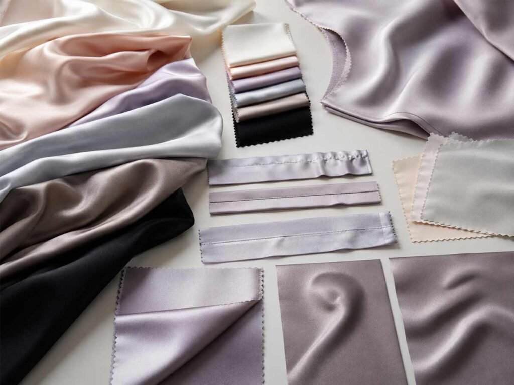
How Should Brands Build a 2027 Palette?
A strong 2027 satin palette combines proven core colors with a limited number of forecast-led shades, then verifies each color on the intended fabric and silhouette. Physical standards, lab dips, sample photography, opacity checks, relevant colorfastness testing, bulk-lot comparison and first-piece approval reduce the gap between an attractive forecast and a commercially reliable dress collection.
Palette Structure
The first decision is not which color looks most exciting. It is what job each color must perform. Core colors remain useful across seasons and support repeat production. Fashion colors refresh familiar silhouettes and connect the range to current demand. Campaign colors are the most visually assertive options, chosen to create strong photography, social content or a recognizable launch image.
These roles change by brand. Luminous Blue may be a campaign shade for a restrained occasion label but a central fashion color for a prom brand. Chocolate may be an emerging seasonal color for one company and a proven neutral for another. A practical starting framework can place roughly half of the offer in proven shades, around one-third in seasonal colors and the remainder in campaign-led options, but historical performance and replenishment speed should always override a generic ratio.
Colorway Depth
The number of colorways should reflect the strength and cost of the style. A proven satin slip dress may support four to six colors because the construction is familiar and the silhouette serves several occasions. A complicated corset dress with cups, boning, custom hardware and specialized trims may be stronger with two or three carefully selected shades. More colors divide inventory and create another set of lab dips, samples, material orders and potential slow sellers.
One useful starting structure is a dependable dark, a light or neutral, a recognizable commercial color and one directional 2027 shade. Not every dress needs all four. A hero gown may be strongest in Luminous Blue and black, while a bridesmaid style needs a coordinated wider palette. Brands with responsive replenishment can test new shades cautiously and add units after early demand, whereas long-lead inventory programs need stricter initial selection.
Lab Dips and Samples
A lab dip is a small fabric submission dyed to match an approved reference. It allows the team to judge hue, depth and undertone on the intended material before bulk dyeing. For satin, this step is especially important because the reflective face can make a small difference feel larger. Phone photographs help with discussion but should not replace a physical standard, since screens, exposure and surrounding light can all distort the shade.
Several neighboring options are often more useful than one attempt. The target can be compared with a warmer, cooler, lighter or deeper alternative, and the approved choice should be recorded with the fabric code, supplier, finish and intended styles. The complete garment remains the decisive test because a lab dip cannot show what happens over bust shaping, gathers, bias folds, lining and stretched areas. Duolan’s internal company fact file identifies fabric sourcing, lab dips, trim matching, pattern adjustment, satin sampling and production handoff as core parts of its dress-development process.
Bulk Consistency
Bulk color control begins before cutting. Fabric rolls should be compared with the approved standard and checked for meaningful side-to-side, end-to-end or roll-to-roll variation. Where variation exists, rolls may need to be grouped so adjoining garment panels do not come from noticeably different lots. The approved sample, physical color standard, fabric specification and production instructions must all refer to the same decision rather than to separate email threads or phone images.
First-piece approval provides another essential checkpoint. The initial production garment brings together bulk fabric, lining, trims, construction and pressing, revealing whether the overall appearance still matches the approved sample. Repeat orders should be compared with retained physical evidence rather than memory. Exact reproduction may not always be possible after yarn, finish or supplier conditions change, but early comparison gives the brand time to assess the difference before finished inventory is produced and shipped.
| Development stage | Working decision | Useful evidence | Risk controlled |
| Palette planning | Assign core, fashion and campaign roles | Color map by launch and style | Disconnected or overloaded range |
| Fabric selection | Confirm weight, fiber, stretch and finish | Full-width swatch and fabric specification | Wrong shine, drape or support |
| Lab-dip review | Approve hue, depth and undertone | Multiple physical submissions | Screen-to-fabric mismatch |
| Sample review | Check color on the actual silhouette | Prototype or fit sample | Shade unsuitable for the garment |
| Photography review | Verify online and campaign appearance | Daylight, studio and indoor images | Poor digital representation |
| Opacity review | Confirm coverage and lining interaction | Garment on body under strong light | Transparency and color shift |
| Bulk-lot review | Check roll and batch consistency | Approved standard and roll inspection | Mixed shades within production |
| First-piece approval | Approve complete production appearance | Initial bulk garment | Repeating an uncorrected defect |
| Repeat-order review | Compare with previous production | Retained swatch and approved garment | Shade drift between deliveries |
From forecast to a production-ready collection. A 2027 satin palette should feel exciting in campaign imagery and disciplined in the production room. Luminous Blue, Pop Pink, warmer yellow, living green, clay and brown offer meaningful directions, but no forecast can replace physical development. The final result depends on the relationship between shade, satin quality, silhouette, lighting, lining, fit and repeatable manufacturing. The most successful ranges will not chase every signal; they will choose a focused set of colors and execute them with unusual care.
Duolan Apparel works with fashion labels developing satin, occasion, party, prom, bridesmaid, wedding-guest, vacation and fitted dress collections. A project can begin with a tech pack, original sample, reference image, mood board or color standard, followed by fabric review, lab dips, pattern and fit development, sampling and bulk-readiness checks. For a useful quotation, share the target market, intended silhouettes, color references, fabric direction, size range, estimated quantity and launch date so the technical team can assess the most practical development route.